Categories Science


Look like that they got a classical case of PCR Cross-Contamination.
They had 2 fabricated samples (SRX9714436 and SRX9714921) on the same PCR run. Alongside with Lung07. They did not perform metagenomic sequencing on the “feces” and they did not get

A positive oral or anal swab from anywhere in their sampling. Feces came from anus and if these were positive the anal swabs must also be positive. Clearly it got there after the NA have been extracted and were from the very low-level degraded RNA which were mutagenized from
The Taq. https://t.co/yKXCgiT29w to see SRX9714921 and SRX9714436.
Human+Mouse in the positive SRA, human in both of them. Seeing human+mouse in identical proportions across 3 different sequencers (PRJNA573298, A22, SEX9714436) are pretty straight indication that the originals
Were already contaminated with Human and mouse from the very beginning, and that this contamination is due to dishonesty in the sample handling process which prescribe a spiking of samples in ACE2-HEK293T/A549, VERO E6 and Human lung xenograft mouse.
The “lineages” they claimed to have found aren’t mutational lineages at all—all the mutations they see on these sequences were unique to that specific sequence, and are the result of RNA degradation and from the Taq polymerase errors accumulated from the nested PCR process


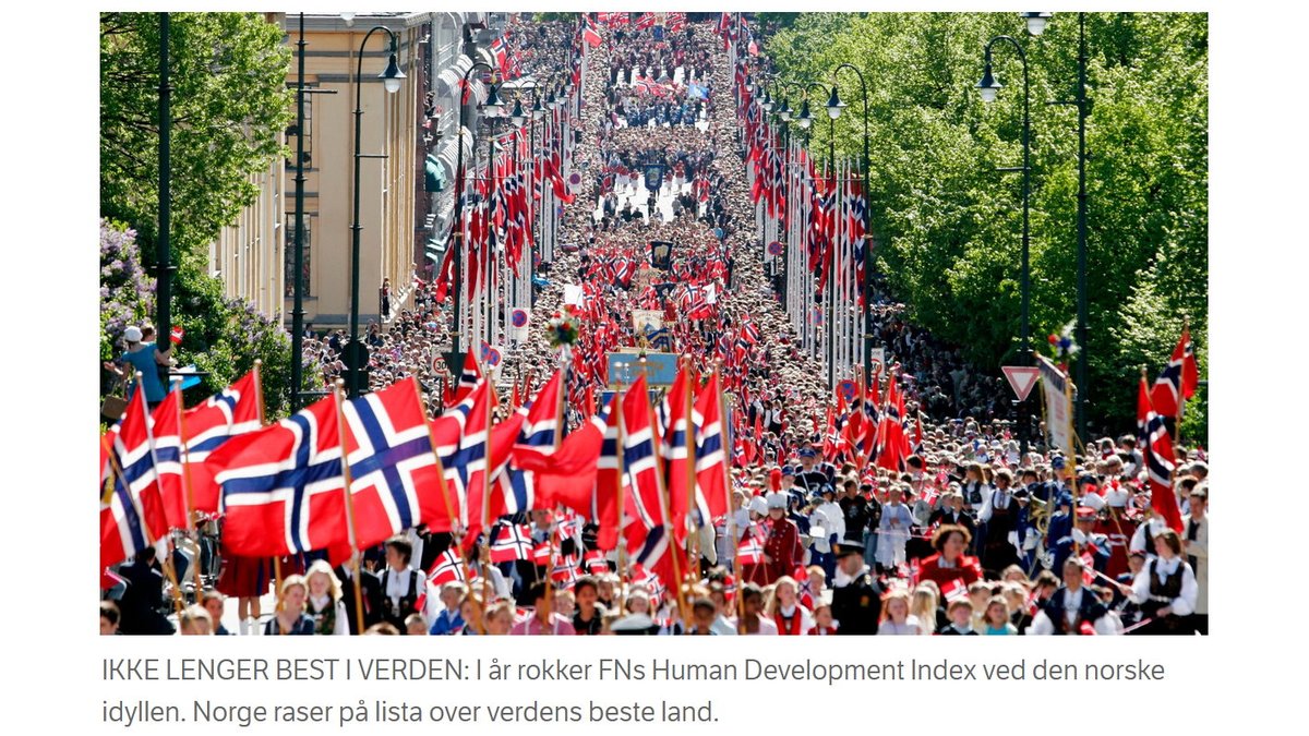
UNEP's new Human Development Index includes a new (separate) index: Planetary pressures-adjusted HDI (PHDI). News in Norway is that its position drops from #1 to #16 because of this, while Ireland rises from #2 to #1.
Why?
https://t.co/aVraIEzRfh
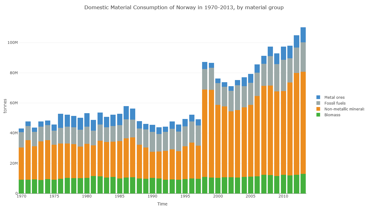
Check out Norway's 'Domestic Material Consumption'. Fossil fuels are no different here to Ireland's. What's different is this huge 'non-metallic minerals' category.
(Note also the jump in 1998, suggesting data problems.)
https://t.co/5QvzONbqmN
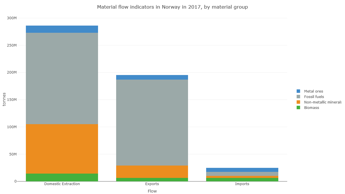
In Norway's case, it looks like the apparent consumption equation (production+imports-exports) for non-metal minerals is dominated by production: extraction of material in Norway.
https://t.co/5QvzONbqmN
And here we see that this production of non-metallic minerals is sand, gravel and crushed rock for construction. So it's about Norway's geology.
https://t.co/y6rqWmFVWc
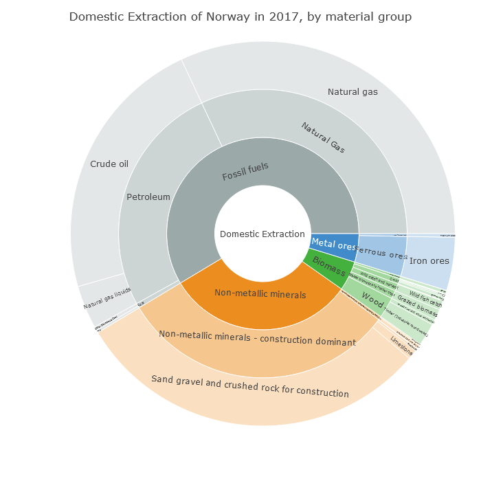
Norway drops 15 places on the PHDI list not because of its CO₂ emissions (fairly high at 41st highest in the world per capita), but because of its geology, because it shifts a lot of rock whenever it builds anything.

https://t.co/mzS7vVSREJ
https://t.co/353PdAX2fa
https://t.co/3yBImjOdd4
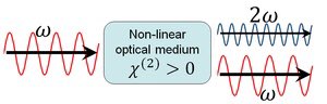
In some cases, almost 100% of the light energy can be converted to the second harmonic frequency. These cases typically involve intense pulsed laser beams passing through large crystals, and careful alignment to obtain phase matching.

1/
I've recently come across a disinformation around evidence relating to school closures and community transmission that's been platformed prominently. This arises from flawed understanding of the data that underlies this evidence, and the methodologies used in these studies. pic.twitter.com/VM7cVKghgj
— Deepti Gurdasani (@dgurdasani1) February 1, 2021
The paper does NOT evaluate the effect of school closures. Instead it conflates all ‘educational settings' into a single category, which includes universities.
2/
The paper primarily evaluates data from March and April 2020. The article is not particularly clear about this limitation, but the information can be found in the hefty supplementary material.
3/
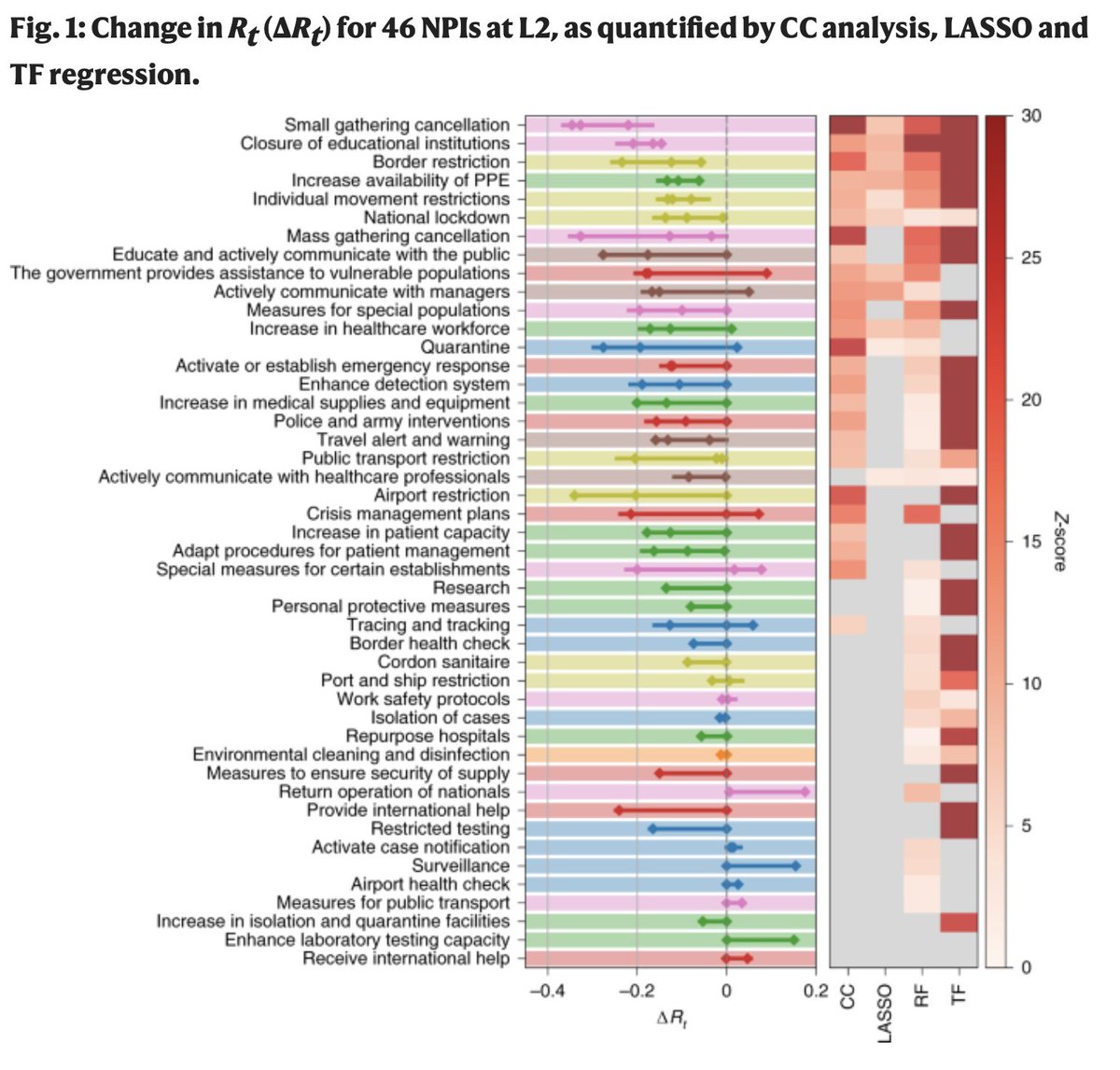
The authors applied four different regression methods (some fancier than others) to the same data. The outcomes of the different regression models are correlated (enough to reach statistical significance), but they vary a lot. (heat map on the right below).
4/
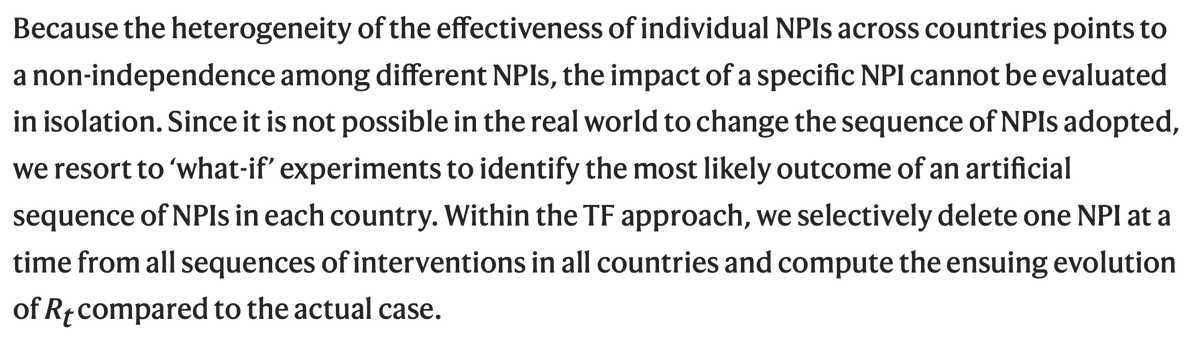
The effect of individual interventions is extremely difficult to disentangle as the authors stress themselves. There is a very large number of interventions considered and the model was run on 49 countries and 26 US States (and not >200 countries).
5/


😭
The new answer to a 77-year-old problem in data analysis, published today in @naturemethods. Instead of significance tests, use estimation graphics. Our software suite DABEST makes it easy for everyone to visualize effect sizes.https://t.co/UzwXJ7EUC5 pic.twitter.com/VtxyY0xaRM
— Adam Claridge-Chang (@adamcchang) June 19, 2019
https://t.co/hm9NoaU4nr
Open letter to journal editors: dynamite plots must die. Dynamite plots, also known as bar and line graphs, hide important information. Editors should require authors to show readers the data and avoid these plots. https://t.co/0GNKEIUCJL pic.twitter.com/OS9ytEFRZN
— Rafael Irizarry (@rafalab) February 22, 2019
https://t.co/8fKDiKjSWc
Couldn't find D3 code for grouped horisontal box plots that show data points so I made this @mbostock @thisisalfie https://t.co/cQjDPhyZdw pic.twitter.com/y6RNmDB2p3
— Ulrik Lyngs (@ulyngs) June 28, 2017
https://t.co/jkaicC1F2x
made a pkg for pirate plots in ggplot: add any of points/means/bars/CIs/violins \u2013 better than ye olde bar/box plotshttps://t.co/Z2m2kW3hsl pic.twitter.com/npAirPQexM
— Mika Braginsky (@mbraginsky) September 28, 2017
https://t.co/PpxWT4Jef4
See the new #PowerBI visual awesomeness for data points & sources, box-&-whisker plots! https://t.co/dOmgoxWfDE pic.twitter.com/HAUOAMJEJW
— Microsoft Power BI (@MSPowerBI) February 1, 2016

It's time, my friends 🤩🤩
[Thread] #ProjectOdin
The Alliance has Project Odin ready to go - the new quantum-based internet. #ElonMusk #QVS #QFS #ProjectOdin
— Der Preu\xdfe Parler: @DerPreusse (@DerPreusse1963) January 12, 2021
https://t.co/fO90N78fta
new quantum-based internet #ElonMusk #QVS #QFS
Political justification ⏬⏬
#ProjectOdin

#ProjectOdin #Starlink #ElonMusk #QuantumInternet