Localized Surface Plasmon Resonance - an overview | ScienceDirect Topics
The term "electro-optic" is often erroneously used as a synonym for "optoelectronic".
are electrical-to-optical
or optical-to-electrical transducers,
or instruments that use such devices in their operation.
◦photodiodes (including solar cells)
◦phototransistors
◦photomultipliers
◦optoisolators
◦integrated optical circuit (IOC) elements
•Photoconductivity, used in:
◦photoresistors
◦photoconductive camera tubes
•Stimulated emission, used in:
◦injection laser diodes
◦quantum cascade lasers
•Lossev effect, or radiative recombination, used in:
◦light-emitting diodes or LED
◦OLEDs
•Photoemissivity, used in
◦photoemissive camera tube
An opto-isolator contains a source (emitter) of light, almost always a near infrared light-emitting diode (LED), that converts electrical input signal into light, a closed optical channel (also called dielectrical channel),
switching pulses (spikes) and perturbations in power supply.
More from NotTheMacAnon


More from Science


1. I find it remarkable that some medics and scientists aren’t raising their voices to make children as safe as possible. The comment about children being less infectious than adults is unsupported by evidence.
2. @c_drosten has talked about this extensively and @dgurdasani1 and @DrZoeHyde have repeatedly pointed out flaws in the studies which have purported to show this. Now for the other assertion: children are very rarely ill with COVID19.
3. Children seem to suffer less with acute illness, but we have no idea of the long-term impact of infection. We do know #LongCovid affects some children. @LongCovidKids now speaks for 1,500 children struggling with a wide range of long-term symptoms.
4. 1,500 children whose parents found a small campaign group. How many more are out there? We don’t know. ONS data suggests there might be many, but the issue hasn’t been studied sufficiently well or long enough for a definitive answer.
5. Some people have talked about #COVID19 being this generation’s Polio. According to US CDC, Polio resulted in inapparent infection in more than 99% of people. Severe disease occurred in a tiny fraction of those infected. Source:
I find it remarkable that a section of society not rejoicing that children very rarely ill with COVID compared to other viruses and much less infectious than adults
— Michael Absoud \U0001f499 (@MAbsoud) February 12, 2021
Instead trying prove the opposite!
Why??
2. @c_drosten has talked about this extensively and @dgurdasani1 and @DrZoeHyde have repeatedly pointed out flaws in the studies which have purported to show this. Now for the other assertion: children are very rarely ill with COVID19.
3. Children seem to suffer less with acute illness, but we have no idea of the long-term impact of infection. We do know #LongCovid affects some children. @LongCovidKids now speaks for 1,500 children struggling with a wide range of long-term symptoms.
4. 1,500 children whose parents found a small campaign group. How many more are out there? We don’t know. ONS data suggests there might be many, but the issue hasn’t been studied sufficiently well or long enough for a definitive answer.
5. Some people have talked about #COVID19 being this generation’s Polio. According to US CDC, Polio resulted in inapparent infection in more than 99% of people. Severe disease occurred in a tiny fraction of those infected. Source:

@mugecevik is an excellent scientist and a responsible professional. She likely read the paper more carefully than most. She grasped some of its strengths and weaknesses that are not apparent from a cursory glance. Below, I will mention a few points some may have missed.
1/
The paper does NOT evaluate the effect of school closures. Instead it conflates all ‘educational settings' into a single category, which includes universities.
2/
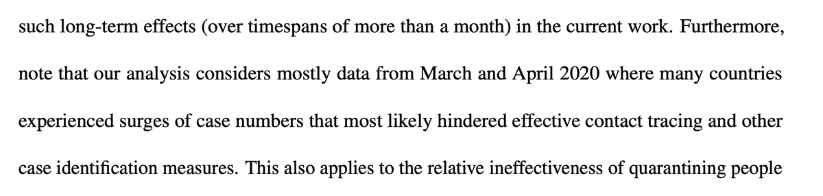
The paper primarily evaluates data from March and April 2020. The article is not particularly clear about this limitation, but the information can be found in the hefty supplementary material.
3/
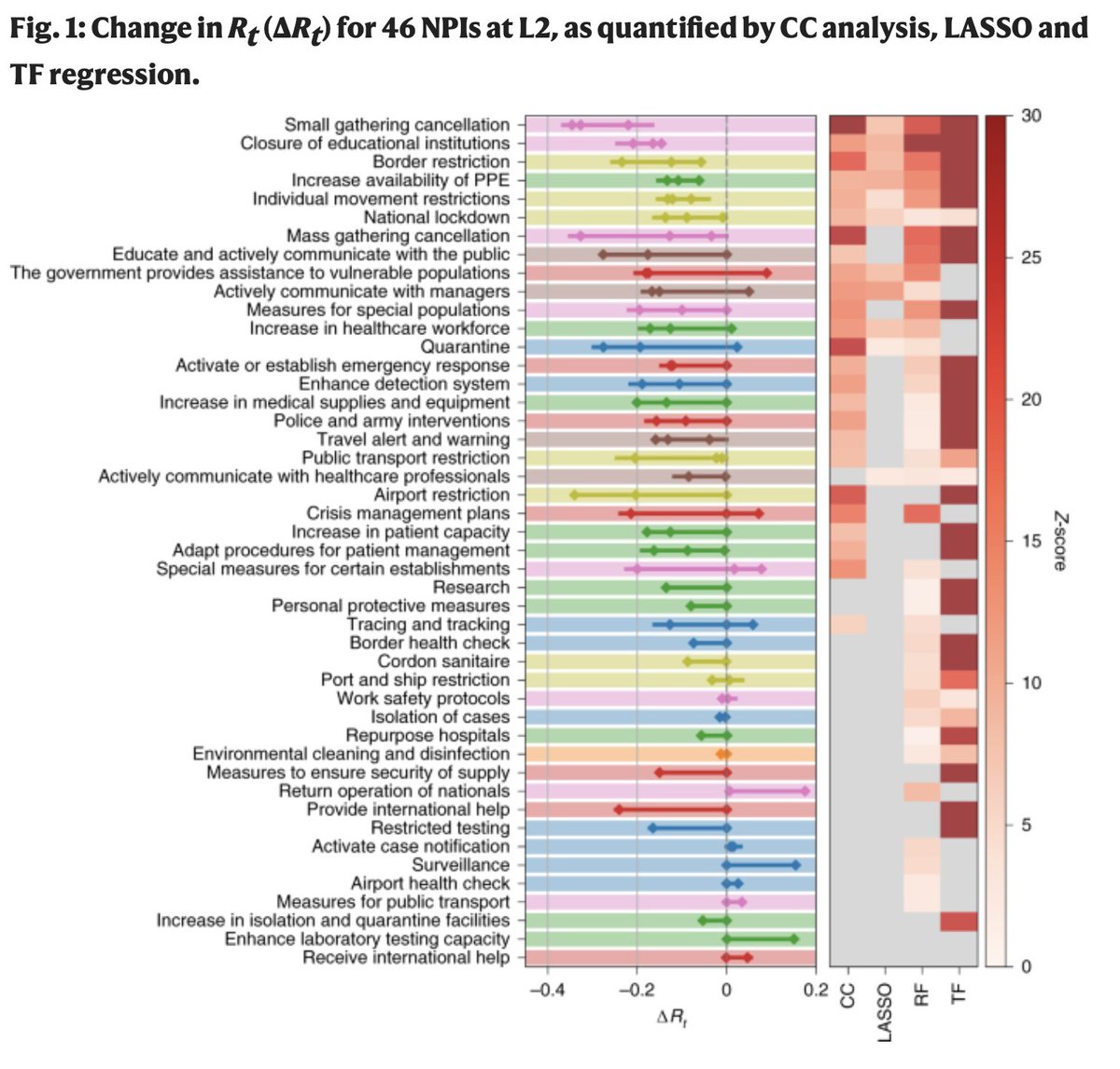
The authors applied four different regression methods (some fancier than others) to the same data. The outcomes of the different regression models are correlated (enough to reach statistical significance), but they vary a lot. (heat map on the right below).
4/
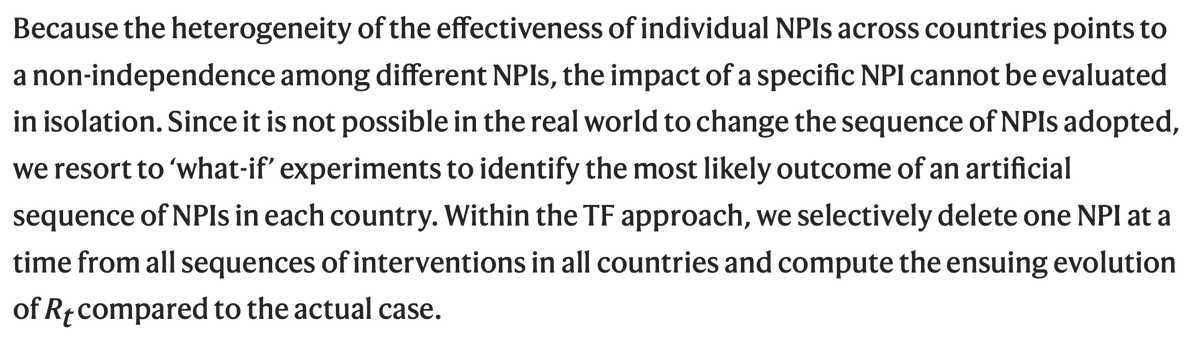
The effect of individual interventions is extremely difficult to disentangle as the authors stress themselves. There is a very large number of interventions considered and the model was run on 49 countries and 26 US States (and not >200 countries).
5/
1/
I've recently come across a disinformation around evidence relating to school closures and community transmission that's been platformed prominently. This arises from flawed understanding of the data that underlies this evidence, and the methodologies used in these studies. pic.twitter.com/VM7cVKghgj
— Deepti Gurdasani (@dgurdasani1) February 1, 2021
The paper does NOT evaluate the effect of school closures. Instead it conflates all ‘educational settings' into a single category, which includes universities.
2/
The paper primarily evaluates data from March and April 2020. The article is not particularly clear about this limitation, but the information can be found in the hefty supplementary material.
3/
The authors applied four different regression methods (some fancier than others) to the same data. The outcomes of the different regression models are correlated (enough to reach statistical significance), but they vary a lot. (heat map on the right below).
4/
The effect of individual interventions is extremely difficult to disentangle as the authors stress themselves. There is a very large number of interventions considered and the model was run on 49 countries and 26 US States (and not >200 countries).
5/

"The new answer to a 77-year-old problem"
😭
https://t.co/hm9NoaU4nr
https://t.co/8fKDiKjSWc
https://t.co/jkaicC1F2x
https://t.co/PpxWT4Jef4
😭
The new answer to a 77-year-old problem in data analysis, published today in @naturemethods. Instead of significance tests, use estimation graphics. Our software suite DABEST makes it easy for everyone to visualize effect sizes.https://t.co/UzwXJ7EUC5 pic.twitter.com/VtxyY0xaRM
— Adam Claridge-Chang (@adamcchang) June 19, 2019
https://t.co/hm9NoaU4nr
Open letter to journal editors: dynamite plots must die. Dynamite plots, also known as bar and line graphs, hide important information. Editors should require authors to show readers the data and avoid these plots. https://t.co/0GNKEIUCJL pic.twitter.com/OS9ytEFRZN
— Rafael Irizarry (@rafalab) February 22, 2019
https://t.co/8fKDiKjSWc
Couldn't find D3 code for grouped horisontal box plots that show data points so I made this @mbostock @thisisalfie https://t.co/cQjDPhyZdw pic.twitter.com/y6RNmDB2p3
— Ulrik Lyngs (@ulyngs) June 28, 2017
https://t.co/jkaicC1F2x
made a pkg for pirate plots in ggplot: add any of points/means/bars/CIs/violins \u2013 better than ye olde bar/box plotshttps://t.co/Z2m2kW3hsl pic.twitter.com/npAirPQexM
— Mika Braginsky (@mbraginsky) September 28, 2017
https://t.co/PpxWT4Jef4
See the new #PowerBI visual awesomeness for data points & sources, box-&-whisker plots! https://t.co/dOmgoxWfDE pic.twitter.com/HAUOAMJEJW
— Microsoft Power BI (@MSPowerBI) February 1, 2016

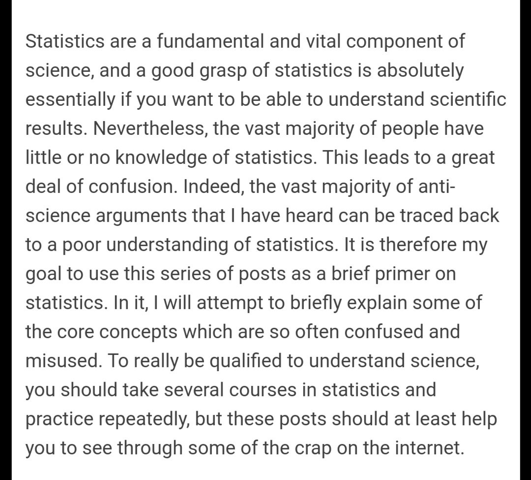
This is a thread on statistics in science: 1/7 (via @LogicofScience)
Basic Statistics Part 1: The Law of Large Numbers https://t.co/wUH8eAAIak
#Science #Statistics
Basic Statistics Part 2: Correlation vs. Causation
https://t.co/Azhyl8pDsX (2/7)
Basic Statistics Part 3: The Dangers of Large Data Sets: A Tale of P values, Error Rates, and Bonferroni Corrections
https://t.co/LetN6aEBRM (3/7)
Basic statistics part 4: understanding P values
https://t.co/K8MMMgTCOf (4/7)
Basic Statistics Part 5: Means vs Medians, Is the “Average”
Basic Statistics Part 1: The Law of Large Numbers https://t.co/wUH8eAAIak
#Science #Statistics
Basic Statistics Part 2: Correlation vs. Causation
https://t.co/Azhyl8pDsX (2/7)
Basic Statistics Part 3: The Dangers of Large Data Sets: A Tale of P values, Error Rates, and Bonferroni Corrections
https://t.co/LetN6aEBRM (3/7)
Basic statistics part 4: understanding P values
https://t.co/K8MMMgTCOf (4/7)
Basic Statistics Part 5: Means vs Medians, Is the “Average”