
1/
This is an interesting review and a good intro to new municipalism (or what @davidjmadden calls 'socialist municipalism')
But it misses some key aspects of what makes the movement distinctive, and distinct from London's municipal socialism.
So here’s a thread on municipalism...
"Politically, socialist municipalism is fundamentally different than the elitist, real-estate-allied stance toward urban development that has come to be known as \u2018urbanism'."@owenhatherley's Red Metropolis reviewed by @davidjmadden for @jacobinmag. \U0001f3d7\ufe0f https://t.co/yF5IZa0FmD
— Repeater Books (@RepeaterBooks) January 26, 2021
1/
2/
3/
4/
5/
6/
7/
8/
9/
10/
11/
12/
13/
14/
@alterurbanist's take on Fearless Cities and new municipalism as moving beyond the 'local trap' (in @antipodeonline): https://t.co/QFs7PRP3hH
15/
work (@rosalux_global) on the centrally important practice of feminising politics: https://t.co/a3Hu8qzvQt
16/
https://t.co/y2aCmeyKNC
17/
https://t.co/qL17JkkwZ3
18/
More from Society


Brief thread to debunk the repeated claims we hear about transmission not happening 'within school walls', infection in school children being 'a reflection of infection from the community', and 'primary school children less likely to get infected and contribute to transmission'.
I've heard a lot of scientists claim these three - including most recently the chief advisor to the CDC, where the claim that most transmission doesn't happen within the walls of schools. There is strong evidence to rebut this claim. Let's look at
Let's look at the trends of infection in different age groups in England first- as reported by the ONS. Being a random survey of infection in the community, this doesn't suffer from the biases of symptom-based testing, particularly important in children who are often asymptomatic
A few things to note:
1. The infection rates among primary & secondary school children closely follow school openings, closures & levels of attendance. E.g. We see a dip in infections following Oct half-term, followed by a rise after school reopening.
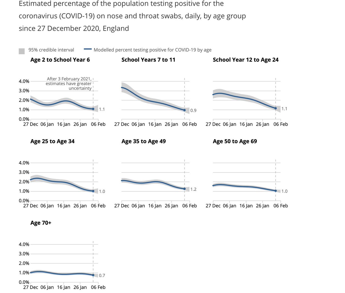
We see steep drops in both primary & secondary school groups after end of term (18th December), but these drops plateau out in primary school children, where attendance has been >20% after re-opening in January (by contrast with 2ndary schools where this is ~5%).
I've heard a lot of scientists claim these three - including most recently the chief advisor to the CDC, where the claim that most transmission doesn't happen within the walls of schools. There is strong evidence to rebut this claim. Let's look at
The science shows us that most disease transmission does not happen in the walls of the school, but it comes in from the community. So, CDC is advocating to get our K-5 students back in school at least in a hybrid mode with universal mask wearing and 6 ft of distancing. https://t.co/dfvJ2nl2s4
— Rochelle Walensky, MD, MPH (@CDCDirector) February 14, 2021
Let's look at the trends of infection in different age groups in England first- as reported by the ONS. Being a random survey of infection in the community, this doesn't suffer from the biases of symptom-based testing, particularly important in children who are often asymptomatic
A few things to note:
1. The infection rates among primary & secondary school children closely follow school openings, closures & levels of attendance. E.g. We see a dip in infections following Oct half-term, followed by a rise after school reopening.
We see steep drops in both primary & secondary school groups after end of term (18th December), but these drops plateau out in primary school children, where attendance has been >20% after re-opening in January (by contrast with 2ndary schools where this is ~5%).
You May Also Like


I just finished Eric Adler's The Battle of the Classics, and wanted to say something about Joel Christiansen's review linked below. I am not sure what motivates the review (I speculate a bit below), but it gives a very misleading impression of the book. 1/x
The meat of the criticism is that the history Adler gives is insufficiently critical. Adler describes a few figures who had a great influence on how the modern US university was formed. It's certainly critical: it focuses on the social Darwinism of these figures. 2/x
Other insinuations and suggestions in the review seem wildly off the mark, distorted, or inappropriate-- for example, that the book is clickbaity (it is scholarly) or conservative (hardly) or connected to the events at the Capitol (give me a break). 3/x
The core question: in what sense is classics inherently racist? Classics is old. On Adler's account, it begins in ancient Rome and is revived in the Renaissance. Slavery (Christiansen's primary concern) is also very old. Let's say classics is an education for slaveowners. 4/x
It's worth remembering that literacy itself is elite throughout most of this history. Literacy is, then, also the education of slaveowners. We can honor oral and musical traditions without denying that literacy is, generally, good. 5/x
As someone\u2019s who\u2019s read the book, this review strikes me as tremendously unfair. It mostly faults Adler for not writing the book the reviewer wishes he had! https://t.co/pqpt5Ziivj
— Teresa M. Bejan (@tmbejan) January 12, 2021
The meat of the criticism is that the history Adler gives is insufficiently critical. Adler describes a few figures who had a great influence on how the modern US university was formed. It's certainly critical: it focuses on the social Darwinism of these figures. 2/x
Other insinuations and suggestions in the review seem wildly off the mark, distorted, or inappropriate-- for example, that the book is clickbaity (it is scholarly) or conservative (hardly) or connected to the events at the Capitol (give me a break). 3/x
The core question: in what sense is classics inherently racist? Classics is old. On Adler's account, it begins in ancient Rome and is revived in the Renaissance. Slavery (Christiansen's primary concern) is also very old. Let's say classics is an education for slaveowners. 4/x
It's worth remembering that literacy itself is elite throughout most of this history. Literacy is, then, also the education of slaveowners. We can honor oral and musical traditions without denying that literacy is, generally, good. 5/x


Ivor Cummins has been wrong (or lying) almost entirely throughout this pandemic and got paid handsomly for it.
He has been wrong (or lying) so often that it will be nearly impossible for me to track every grift, lie, deceit, manipulation he has pulled. I will use...

... other sources who have been trying to shine on light on this grifter (as I have tried to do, time and again:
Example #1: "Still not seeing Sweden signal versus Denmark really"... There it was (Images attached).
19 to 80 is an over 300% difference.
Tweet: https://t.co/36FnYnsRT9

Example #2 - "Yes, I'm comparing the Noridcs / No, you cannot compare the Nordics."
I wonder why...
Tweets: https://t.co/XLfoX4rpck / https://t.co/vjE1ctLU5x

Example #3 - "I'm only looking at what makes the data fit in my favour" a.k.a moving the goalposts.
Tweets: https://t.co/vcDpTu3qyj / https://t.co/CA3N6hC2Lq

He has been wrong (or lying) so often that it will be nearly impossible for me to track every grift, lie, deceit, manipulation he has pulled. I will use...
... other sources who have been trying to shine on light on this grifter (as I have tried to do, time and again:
Ivor Cummins BE (Chem) is a former R&D Manager at HP (sourcre: https://t.co/Wbf5scf7gn), turned Content Creator/Podcast Host/YouTube personality. (Call it what you will.)
— Steve (@braidedmanga) November 17, 2020
Example #1: "Still not seeing Sweden signal versus Denmark really"... There it was (Images attached).
19 to 80 is an over 300% difference.
Tweet: https://t.co/36FnYnsRT9
Example #2 - "Yes, I'm comparing the Noridcs / No, you cannot compare the Nordics."
I wonder why...
Tweets: https://t.co/XLfoX4rpck / https://t.co/vjE1ctLU5x
Example #3 - "I'm only looking at what makes the data fit in my favour" a.k.a moving the goalposts.
Tweets: https://t.co/vcDpTu3qyj / https://t.co/CA3N6hC2Lq

First update to https://t.co/lDdqjtKTZL since the challenge ended – Medium links!! Go add your Medium profile now 👀📝 (thanks @diannamallen for the suggestion 😁)

Just added Telegram links to https://t.co/lDdqjtKTZL too! Now you can provide a nice easy way for people to message you :)

Less than 1 hour since I started adding stuff to https://t.co/lDdqjtKTZL again, and profile pages are now responsive!!! 🥳 Check it out -> https://t.co/fVkEL4fu0L

Accounts page is now also responsive!! 📱✨

💪 I managed to make the whole site responsive in about an hour. On my roadmap I had it down as 4-5 hours!!! 🤘🤠🤘
Just added Telegram links to https://t.co/lDdqjtKTZL too! Now you can provide a nice easy way for people to message you :)
Less than 1 hour since I started adding stuff to https://t.co/lDdqjtKTZL again, and profile pages are now responsive!!! 🥳 Check it out -> https://t.co/fVkEL4fu0L
Accounts page is now also responsive!! 📱✨
💪 I managed to make the whole site responsive in about an hour. On my roadmap I had it down as 4-5 hours!!! 🤘🤠🤘