Hello friends! Freelance photojournalist and accidental labour organizer, @photobracken here to tell you just how not good it’s been for photographers *gestures broadly at everything* esp freelancers, and what we are doing about it over at @PhotojsUnited.


https://t.co/aPrQfrvv34


https://t.co/u0Phdp9Yoy


@thenarwhalca for having my back.


More from Society

1/OK, data mystery time.
This New York Times feature shows China with a Gini Index of less than 30, which would make it more equal than Canada, France, or the Netherlands. https://t.co/g3Sv6DZTDE
That's weird. Income inequality in China is legendary.
Let's check this number.
2/The New York Times cites the World Bank's recent report, "Fair Progress? Economic Mobility across Generations Around the World".
The report is available here:
3/The World Bank report has a graph in which it appears to show the same value for China's Gini - under 0.3.
The graph cites the World Development Indicators as its source for the income inequality data.
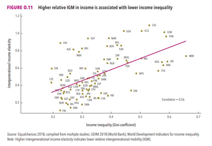
4/The World Development Indicators are available at the World Bank's website.
Here's the Gini index: https://t.co/MvylQzpX6A
It looks as if the latest estimate for China's Gini is 42.2.
That estimate is from 2012.
5/A Gini of 42.2 would put China in the same neighborhood as the U.S., whose Gini was estimated at 41 in 2013.
I can't find the <30 number anywhere. The only other estimate in the tables for China is from 2008, when it was estimated at 42.8.
This New York Times feature shows China with a Gini Index of less than 30, which would make it more equal than Canada, France, or the Netherlands. https://t.co/g3Sv6DZTDE
That's weird. Income inequality in China is legendary.
Let's check this number.
2/The New York Times cites the World Bank's recent report, "Fair Progress? Economic Mobility across Generations Around the World".
The report is available here:
3/The World Bank report has a graph in which it appears to show the same value for China's Gini - under 0.3.
The graph cites the World Development Indicators as its source for the income inequality data.
4/The World Development Indicators are available at the World Bank's website.
Here's the Gini index: https://t.co/MvylQzpX6A
It looks as if the latest estimate for China's Gini is 42.2.
That estimate is from 2012.
5/A Gini of 42.2 would put China in the same neighborhood as the U.S., whose Gini was estimated at 41 in 2013.
I can't find the <30 number anywhere. The only other estimate in the tables for China is from 2008, when it was estimated at 42.8.

global health policy in 2020 has centered around NPI's (non-pharmaceutical interventions) like distancing, masks, school closures
these have been sold as a way to stop infection as though this were science.
this was never true and that fact was known and knowable.
let's look.
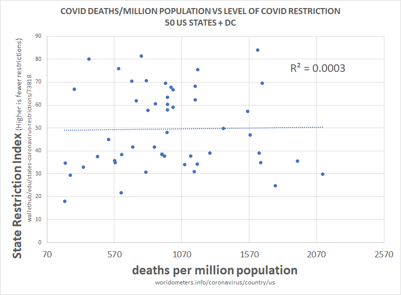
above is the plot of social restriction and NPI vs total death per million. there is 0 R2. this means that the variables play no role in explaining one another.
we can see this same relationship between NPI and all cause deaths.
this is devastating to the case for NPI.
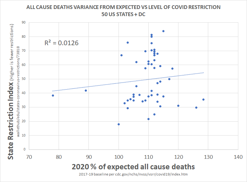
clearly, correlation is not proof of causality, but a total lack of correlation IS proof that there was no material causality.
barring massive and implausible coincidence, it's essentially impossible to cause something and not correlate to it, especially 51 times.
this would seem to pose some very serious questions for those claiming that lockdowns work, those basing policy upon them, and those claiming this is the side of science.
there is no science here nor any data. this is the febrile imaginings of discredited modelers.
this has been clear and obvious from all over the world since the beginning and had been proven so clearly by may that it's hard to imagine anyone who is actually conversant with the data still believing in these responses.
everyone got the same R
these have been sold as a way to stop infection as though this were science.
this was never true and that fact was known and knowable.
let's look.
above is the plot of social restriction and NPI vs total death per million. there is 0 R2. this means that the variables play no role in explaining one another.
we can see this same relationship between NPI and all cause deaths.
this is devastating to the case for NPI.
clearly, correlation is not proof of causality, but a total lack of correlation IS proof that there was no material causality.
barring massive and implausible coincidence, it's essentially impossible to cause something and not correlate to it, especially 51 times.
this would seem to pose some very serious questions for those claiming that lockdowns work, those basing policy upon them, and those claiming this is the side of science.
there is no science here nor any data. this is the febrile imaginings of discredited modelers.
this has been clear and obvious from all over the world since the beginning and had been proven so clearly by may that it's hard to imagine anyone who is actually conversant with the data still believing in these responses.
everyone got the same R
this methodology is a little complex, so let me explain what i did.
— el gato malo (@boriquagato) May 30, 2020
a few EU countries provide real day of death data. this lets us plot meaningful curves to show rate of disease change.
what struck me is how similar all the curves were.
everyone got the same shape. pic.twitter.com/bN0hILzoSl


I've seen many news articles cite that "the UK variant could be the dominant strain by March". This is emphasized by @CDCDirector.
While this will likely to be the case, this should not be an automatic cause for concern. Cases could still remain contained.
Here's how: 🧵
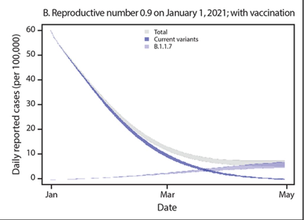
One of @CDCgov's own models has tracked the true decline in cases quite accurately thus far.
Their projection shows that the B.1.1.7 variant will become the dominant variant in March. But interestingly... there's no fourth wave. Cases simply level out:
https://t.co/tDce0MwO61
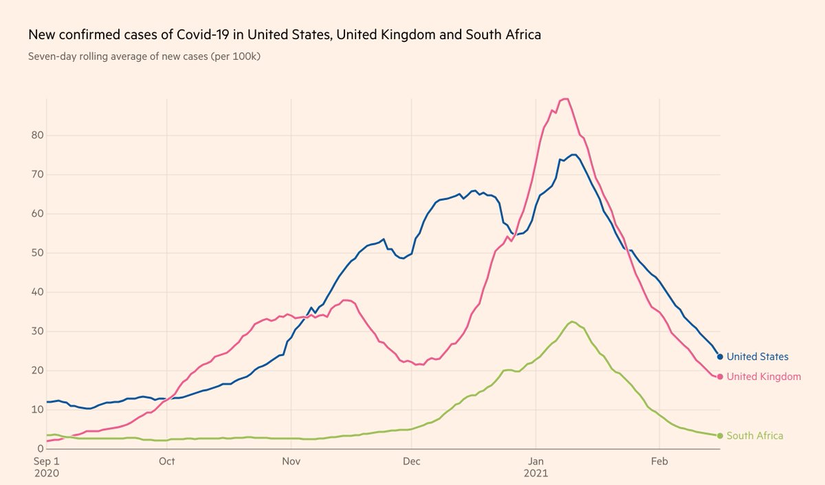
Just because a variant becomes the dominant strain does not automatically mean we will see a repeat of Fall 2020.
Let's look at UK and South Africa, where cases have been falling for the past month, in unison with the US (albeit with tougher restrictions):
Furthermore, the claim that the "variant is doubling every 10 days" is false. It's the *proportion of the variant* that is doubling every 10 days.
If overall prevalence drops during the studied time period, the true doubling time of the variant is actually much longer 10 days.
Simple example:
Day 0: 10 variant / 100 cases -> 10% variant
Day 10: 15 variant / 75 cases -> 20% variant
Day 20: 20 variant / 50 cases -> 40% variant
1) Proportion of variant doubles every 10 days
2) Doubling time of variant is actually 20 days
3) Total cases still drop by 50%
While this will likely to be the case, this should not be an automatic cause for concern. Cases could still remain contained.
Here's how: 🧵
One of @CDCgov's own models has tracked the true decline in cases quite accurately thus far.
Their projection shows that the B.1.1.7 variant will become the dominant variant in March. But interestingly... there's no fourth wave. Cases simply level out:
https://t.co/tDce0MwO61
Just because a variant becomes the dominant strain does not automatically mean we will see a repeat of Fall 2020.
Let's look at UK and South Africa, where cases have been falling for the past month, in unison with the US (albeit with tougher restrictions):
Furthermore, the claim that the "variant is doubling every 10 days" is false. It's the *proportion of the variant* that is doubling every 10 days.
If overall prevalence drops during the studied time period, the true doubling time of the variant is actually much longer 10 days.
Simple example:
Day 0: 10 variant / 100 cases -> 10% variant
Day 10: 15 variant / 75 cases -> 20% variant
Day 20: 20 variant / 50 cases -> 40% variant
1) Proportion of variant doubles every 10 days
2) Doubling time of variant is actually 20 days
3) Total cases still drop by 50%