Technology is connected to the "tailpipes" of these facilities and is used to remove CO2 from the plant exhaust.
What is carbon capture? And how does it work?
While carbon capture is regularly discussed in the media, no one really ever explains what it is.
Below is a quick thread discussing the technology behind traditional carbon capture 👇
Technology is connected to the "tailpipes" of these facilities and is used to remove CO2 from the plant exhaust.
This step is called "sequestration" and is why experts often talks about "carbon capture and sequestration" or "CCS".
Currently, one of the most economic forms of carbon capture is called "amine-based" capture.
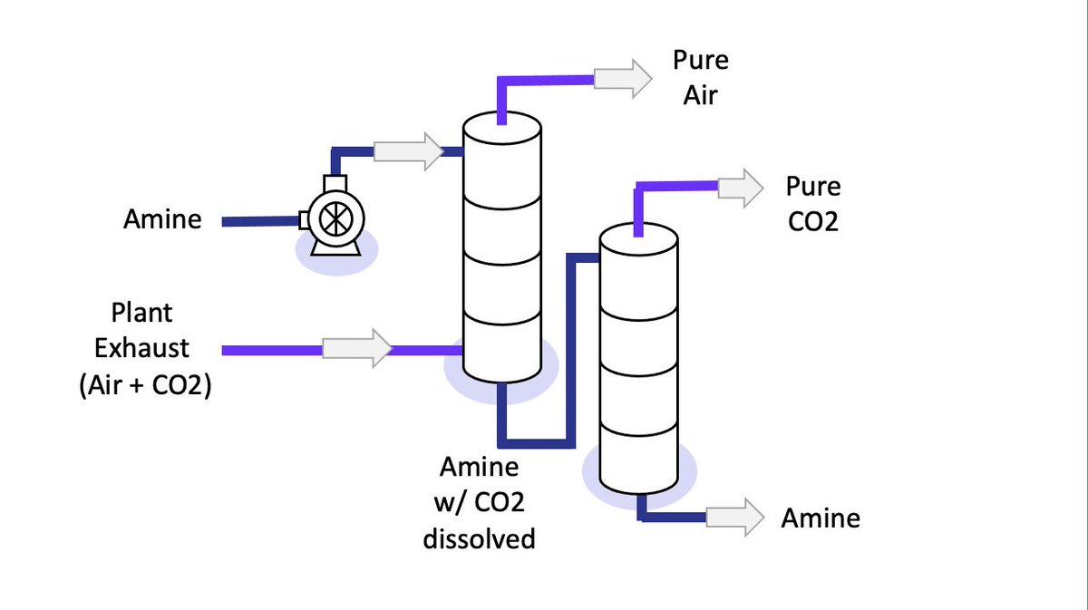
An "amine" is a special liquid chemical which selectively grabs on to CO2 molecules.
The exhaust bubbles up through the column, and the amine drips down.
The liquid amine and gas exhaust mix in the column.
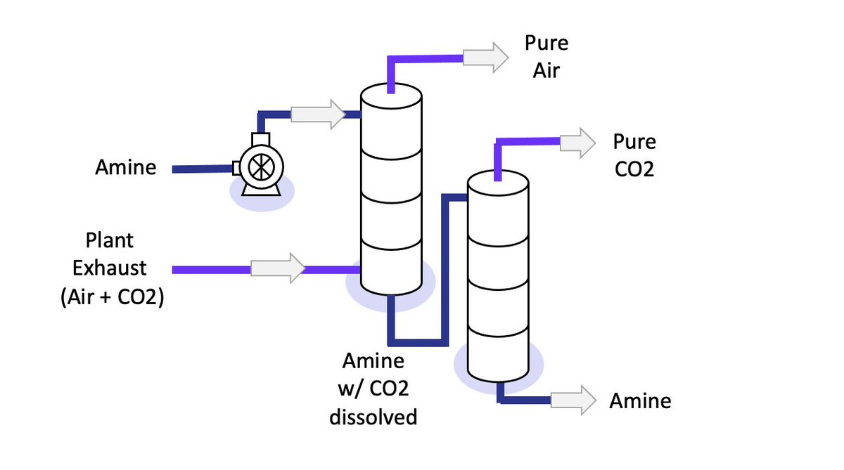
The amine with dissolved CO2 is sent into a second column where it is heated.
In the second column, the CO2 pops out of the amine.
Now, we have separated the CO2.
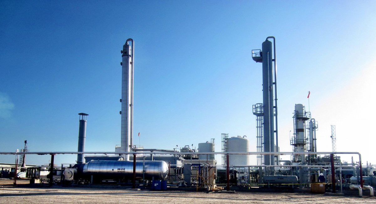
Below is a picture of an amine plant used for CO2 scrubbing.
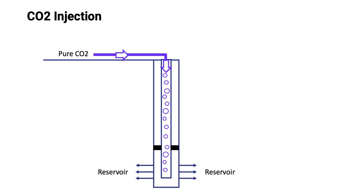
The CO2 is injected into a well for permanent storage underground, usually a few hundred yards away.
What I've described is called "point source capture" because it captures CO2 from a single plant exhaust
With new advances in technology, CO2 can also be captured directly from the air we breathe
More from Science




https://t.co/a6yrWK5dqg

https://t.co/Xe5xFdtDfO
https://t.co/e3RBxj0ly3
https://t.co/cJlCMqyP2v
https://t.co/5n5TK67iKB

https://t.co/Xe5xFdtDfO
https://t.co/e3RBxj0ly3
1. Monkey Outrage!
— Billy Bostickson \U0001f3f4\U0001f441&\U0001f441 \U0001f193 (@BillyBostickson) August 17, 2020
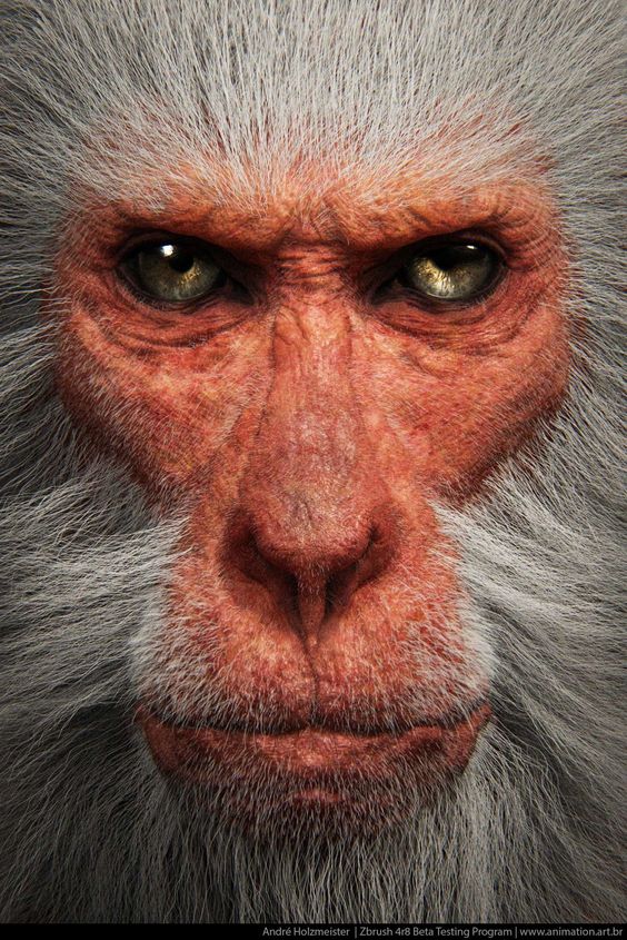
The worst treatment was kept for the monkeys. The macaques breed of monkeys are small, relatively light primates, which are often used for animal experiments at LPT. \u2018They are kept in cramped conditions in small cages. https://t.co/6D0yisjd9B
https://t.co/cJlCMqyP2v
11. Max Planck Monkey Photos (2) pic.twitter.com/0yE9D6iswp
— Billy Bostickson \U0001f3f4\U0001f441&\U0001f441 \U0001f193 (@BillyBostickson) August 17, 2020
https://t.co/5n5TK67iKB

"The new answer to a 77-year-old problem"
😭
https://t.co/hm9NoaU4nr
https://t.co/8fKDiKjSWc
https://t.co/jkaicC1F2x
https://t.co/PpxWT4Jef4
😭
The new answer to a 77-year-old problem in data analysis, published today in @naturemethods. Instead of significance tests, use estimation graphics. Our software suite DABEST makes it easy for everyone to visualize effect sizes.https://t.co/UzwXJ7EUC5 pic.twitter.com/VtxyY0xaRM
— Adam Claridge-Chang (@adamcchang) June 19, 2019
https://t.co/hm9NoaU4nr
Open letter to journal editors: dynamite plots must die. Dynamite plots, also known as bar and line graphs, hide important information. Editors should require authors to show readers the data and avoid these plots. https://t.co/0GNKEIUCJL pic.twitter.com/OS9ytEFRZN
— Rafael Irizarry (@rafalab) February 22, 2019
https://t.co/8fKDiKjSWc
Couldn't find D3 code for grouped horisontal box plots that show data points so I made this @mbostock @thisisalfie https://t.co/cQjDPhyZdw pic.twitter.com/y6RNmDB2p3
— Ulrik Lyngs (@ulyngs) June 28, 2017
https://t.co/jkaicC1F2x
made a pkg for pirate plots in ggplot: add any of points/means/bars/CIs/violins \u2013 better than ye olde bar/box plotshttps://t.co/Z2m2kW3hsl pic.twitter.com/npAirPQexM
— Mika Braginsky (@mbraginsky) September 28, 2017
https://t.co/PpxWT4Jef4
See the new #PowerBI visual awesomeness for data points & sources, box-&-whisker plots! https://t.co/dOmgoxWfDE pic.twitter.com/HAUOAMJEJW
— Microsoft Power BI (@MSPowerBI) February 1, 2016