
What if the false diagnosis rate was 90%?
Don’t misunderstand me. I’m a thorough believer in the existence of this virus.

I expect the ‘wait two weeks’ warning will be given & I do worry about that. Nothing in this mornings tweets asks anyone to do...
More from Yardley Yeadon


@ukiswitheu I invite people to run the thought experiment: “what if the ‘cases’ data is inaccurate?”
Ignore ‘cases’, look instead only at excess deaths (per M Levitt’s tweet). Does that look characteristic of an epidemic? It’s completely diff from spring or any winter flu outbreak.
London:

Can anyone explain why there is no ‘2nd wave’ of excess deaths in London, without invoking herd immunity?
It’s not lockdown. See NW England:
This is the largest #SecondaryRipple (which I predicted).

https://t.co/b0rT5Lq9HI
Now check the 3 predictions I made months ago. They’ve all happened. Compare predictions from SAGE’s statements: they’re all wrong.
Even neutrals at this point might ask themselves “if he’s been right on all predictions, maybe he’s correct now?”

I’ve been saying since the Lighthouse Labs got up & running that I’m deeply sceptical about the trustworthiness of their ‘cases’ data. I showed how, at low virus prevalence, the PCR mass testing data was throwing out potentially 90% positives being
https://t.co/t4qQN4rH0u
I got ‘fact checked’ a LOT over that statement. This paper just published, about precisely that time period I speculated about. Turns out that high-80s% of Dr Healy’s positives by PCR were FALSE. This alone is sufficient in my view to throw severe doubt...
Ignore ‘cases’, look instead only at excess deaths (per M Levitt’s tweet). Does that look characteristic of an epidemic? It’s completely diff from spring or any winter flu outbreak.
London:
Can anyone explain why there is no ‘2nd wave’ of excess deaths in London, without invoking herd immunity?
It’s not lockdown. See NW England:
This is the largest #SecondaryRipple (which I predicted).
https://t.co/b0rT5Lq9HI
Now check the 3 predictions I made months ago. They’ve all happened. Compare predictions from SAGE’s statements: they’re all wrong.
Even neutrals at this point might ask themselves “if he’s been right on all predictions, maybe he’s correct now?”
I’ve been saying since the Lighthouse Labs got up & running that I’m deeply sceptical about the trustworthiness of their ‘cases’ data. I showed how, at low virus prevalence, the PCR mass testing data was throwing out potentially 90% positives being
https://t.co/t4qQN4rH0u
I got ‘fact checked’ a LOT over that statement. This paper just published, about precisely that time period I speculated about. Turns out that high-80s% of Dr Healy’s positives by PCR were FALSE. This alone is sufficient in my view to throw severe doubt...

I urge all followers who have read my criticisms of PCR mass testing in U.K. to carefully read Mr Fordham’s carefully worded letter. Note that the innovation minister in the Lords, Lord Bethel, already admitted that the PCR system doesn’t have the equivalent of an MOT. https://t.co/zXzeDMKCBb

Without this information it’s impossible to interpret any result. If the oFPR is 4%, for example, and if the true prevalence is 0.3% (it’s probably less), then for every 10,000 tests, 400 positives would be false & 30 positives would be genuine. So 93% of positives are false.
As Mr Fordham points out, almost all policies pivot on PCR mass testing. Hancock previously admitted on talkRADIO to Julia Hartley-Brewer in late summer that the FPR was “just under 1%”. That was a flat lie (possibly inadvertent but he’s never corrected the record). The reason...
...we are sure Hancock told a lie is that they have never known the FPR. Those including Hancock who believe that the oFPR can be estimated by inspection of the lowest positivity ever recorded, while logical, is completely wrong. Changes in personnel, throughout, testing...
...architecture & the like can radically alter the oFPR. Since Hancock’s remark in late summer, PCR mass testing has moved into the Lighthouse Labs & this creates a new & urgent need to continually assess oFPR. I’ve good reason to believe it’s now VERY much higher now that the...
So I wrote back to @lucyfrazermp for another go. Here\u2019s my letter.
— Edmund Fordham (@EdmundFordham) November 28, 2020
They don\u2019t understand how serious this is.
If they can\u2019t tell us the oFPR, our PCR testing is worthless. (thread) pic.twitter.com/zHJ8SJCzf1
Without this information it’s impossible to interpret any result. If the oFPR is 4%, for example, and if the true prevalence is 0.3% (it’s probably less), then for every 10,000 tests, 400 positives would be false & 30 positives would be genuine. So 93% of positives are false.
As Mr Fordham points out, almost all policies pivot on PCR mass testing. Hancock previously admitted on talkRADIO to Julia Hartley-Brewer in late summer that the FPR was “just under 1%”. That was a flat lie (possibly inadvertent but he’s never corrected the record). The reason...
...we are sure Hancock told a lie is that they have never known the FPR. Those including Hancock who believe that the oFPR can be estimated by inspection of the lowest positivity ever recorded, while logical, is completely wrong. Changes in personnel, throughout, testing...
...architecture & the like can radically alter the oFPR. Since Hancock’s remark in late summer, PCR mass testing has moved into the Lighthouse Labs & this creates a new & urgent need to continually assess oFPR. I’ve good reason to believe it’s now VERY much higher now that the...
More from Health


You gotta think about this one carefully!
Imagine you go to the doctor and get tested for a rare disease (only 1 in 10,000 people get it.)
The test is 99% effective in detecting both sick and healthy people.
Your test comes back positive.
Are you really sick? Explain below 👇
The most complete answer from every reply so far is from Dr. Lena. Thanks for taking the time and going through
You can get the answer using Bayes' theorem, but let's try to come up with it in a different —maybe more intuitive— way.
👇
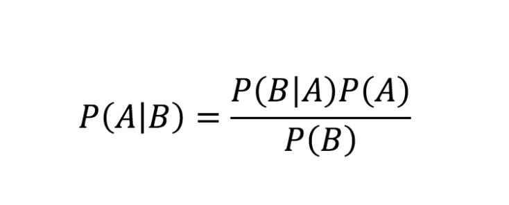
Here is what we know:
- Out of 10,000 people, 1 is sick
- Out of 100 sick people, 99 test positive
- Out of 100 healthy people, 99 test negative
Assuming 1 million people take the test (including you):
- 100 of them are sick
- 999,900 of them are healthy
👇
Let's now test both groups, starting with the 100 people sick:
▫️ 99 of them will be diagnosed (correctly) as sick (99%)
▫️ 1 of them is going to be diagnosed (incorrectly) as healthy (1%)
👇
Imagine you go to the doctor and get tested for a rare disease (only 1 in 10,000 people get it.)
The test is 99% effective in detecting both sick and healthy people.
Your test comes back positive.
Are you really sick? Explain below 👇
The most complete answer from every reply so far is from Dr. Lena. Thanks for taking the time and going through
Really doesn\u2019t fit well in a tweet. pic.twitter.com/xN0pAyniFS
— Dr. Lena Sugar \U0001f3f3\ufe0f\u200d\U0001f308\U0001f1ea\U0001f1fa\U0001f1ef\U0001f1f5 (@_jvs) February 18, 2021
You can get the answer using Bayes' theorem, but let's try to come up with it in a different —maybe more intuitive— way.
👇
Here is what we know:
- Out of 10,000 people, 1 is sick
- Out of 100 sick people, 99 test positive
- Out of 100 healthy people, 99 test negative
Assuming 1 million people take the test (including you):
- 100 of them are sick
- 999,900 of them are healthy
👇
Let's now test both groups, starting with the 100 people sick:
▫️ 99 of them will be diagnosed (correctly) as sick (99%)
▫️ 1 of them is going to be diagnosed (incorrectly) as healthy (1%)
👇

You May Also Like


1/OK, data mystery time.
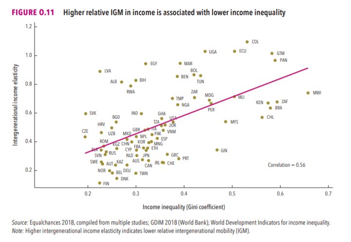
This New York Times feature shows China with a Gini Index of less than 30, which would make it more equal than Canada, France, or the Netherlands. https://t.co/g3Sv6DZTDE
That's weird. Income inequality in China is legendary.
Let's check this number.
2/The New York Times cites the World Bank's recent report, "Fair Progress? Economic Mobility across Generations Around the World".
The report is available here:
3/The World Bank report has a graph in which it appears to show the same value for China's Gini - under 0.3.
The graph cites the World Development Indicators as its source for the income inequality data.
4/The World Development Indicators are available at the World Bank's website.
Here's the Gini index: https://t.co/MvylQzpX6A
It looks as if the latest estimate for China's Gini is 42.2.
That estimate is from 2012.
5/A Gini of 42.2 would put China in the same neighborhood as the U.S., whose Gini was estimated at 41 in 2013.
I can't find the <30 number anywhere. The only other estimate in the tables for China is from 2008, when it was estimated at 42.8.


