GIVING FEEDBACK in GOOGLE CLASSROOM
Tips for giving students feedback on their work (avoiding add-ons) within Google Classroom
Please read, share and add more ideas.
👇👇👇
#GoogleClassroom
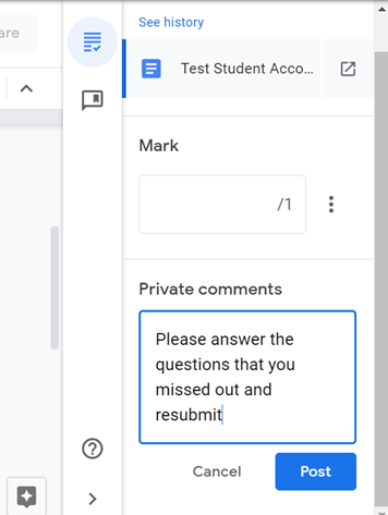
You can make this on a google doc/slide and then paste the link into their private comments.
You can link different students to different links if needed
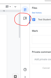
you can type directly on to their work. You might want to do this in a different colour so it stands out.
Select 'edit' the document and type on to it
Students can then respond and resubmit
Make a copy of a document for each student so they can respond/annotate their own version. pic.twitter.com/UaTJdAlPly
— Miss (@missdcox) January 9, 2021
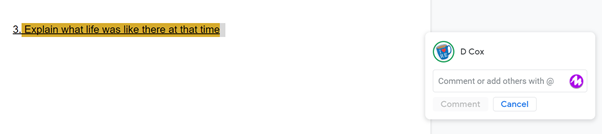
Add comments that you what to be able to reuse.
These comments stay the same no matter which student/class you are using them with.
Click the + box
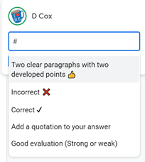
You can free type into this box or to use the comment bank....
Start typing the beginning of the comment you know you have in your comment bank and comments will appear that have those letters in.
Select the comment you want
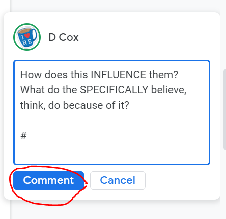
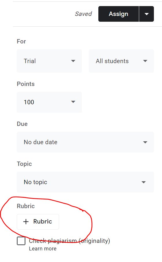
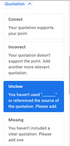
Use simple statements to feedback on the quality of student response. This can be with/without marks.
Think carefully what criteria make a ‘perfect’ piece of work and what the stages might be to get there.
I used a template from here https://t.co/vrXAQZ4jZo
however I edited it to give me more flexibility in what I wanted.
See a ‘copy of one of my examples here: https://t.co/y98fId0ppX
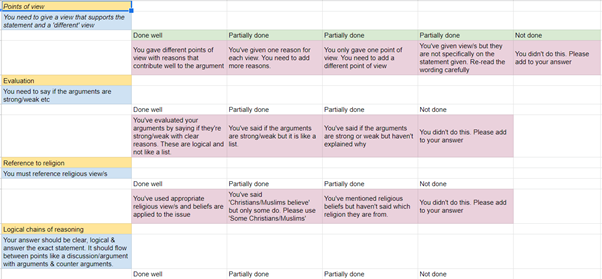
You just select which is the most appropriate for that student in that area of their work.
People can also share rubrics on social media for specific tasks or texts etc Just make sure you lock it & share for people to download/copy only
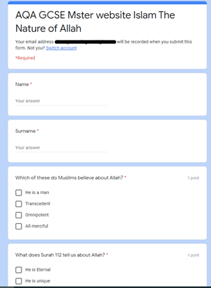
Make a form to find out what students 'know' &'understand' as a quiz.
You can then analyse common errors & set a task to address these.
which @josephkinnaird showed me.
It records a short snip of you speaking in which you can give feedback. Here is Joe's thread on how you could use it.
https://t.co/PqIn1nhiV0
A short thread of how you can use Mote within Google Classroom.
— Joe Kinnaird (@josephkinnaird) January 10, 2021
More from Tech


One of the best decisions I made during a very turbulent 2020 was to leave conventional coding behind and embrace the #nocode movement. @bubble made this a reality. Although my own journey thus far is premature, I’ve learned a lot so here’s a power thread on....
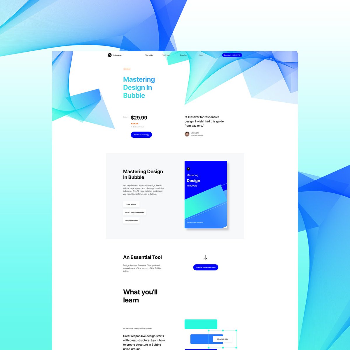
‘How I created @buildcamp sales funnel landing page in under 2hours’.
Preview here 👇
https://t.co/s9P5JodSHe
Power thread here 👇
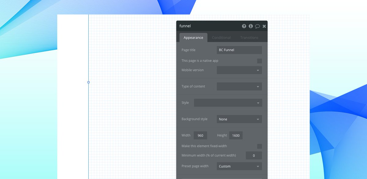
1. Started with a vanilla bubble app ensuring that all styles and UI elements were removed. Created a new page called funnel and set the page size to 960px as this allows the page to render proportionately on both web and mobile when hitting responsive breakpoints.
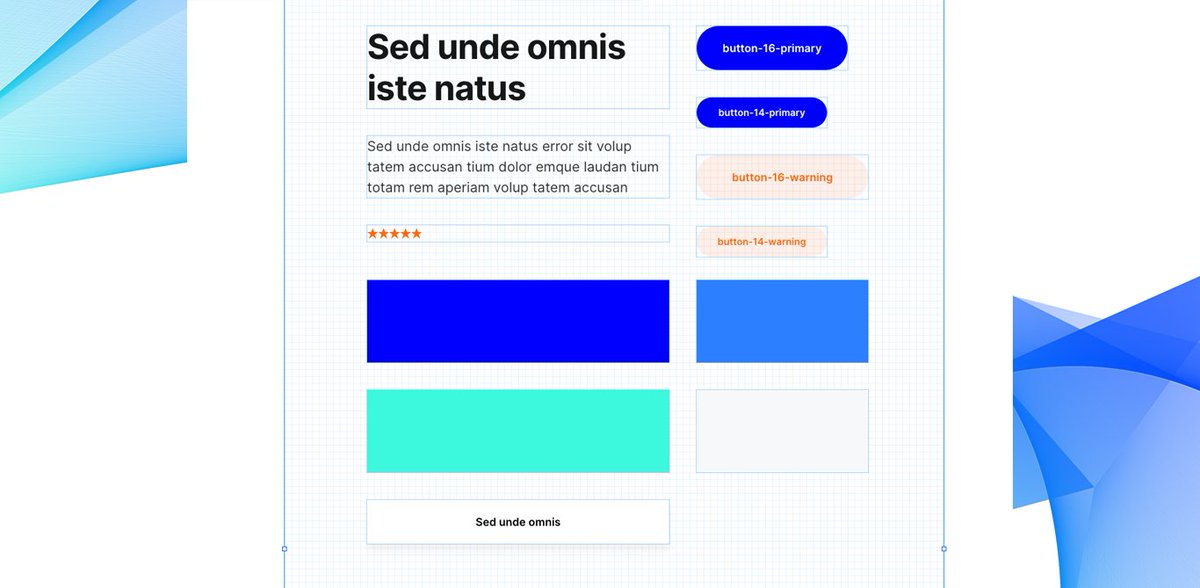
2. Began dropping elements onto the page to ‘find the style’. These had to be closely aligned to our @buildcamp branding so included text, buttons and groups - nothing too heavy. Played around with a few fonts, colors and gradients and thus pinned down the following style guide.
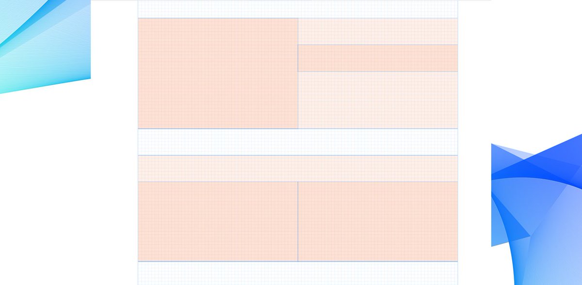
3. Started to map out sections using groups as my ‘containers’ to hold the relevant information and imagery needed to pad out the sales pitch. At this point, they were merely blocks of color #ff6600 with reduced opacity set to 5% to ease page flair.
‘How I created @buildcamp sales funnel landing page in under 2hours’.
Preview here 👇
https://t.co/s9P5JodSHe
Power thread here 👇
1. Started with a vanilla bubble app ensuring that all styles and UI elements were removed. Created a new page called funnel and set the page size to 960px as this allows the page to render proportionately on both web and mobile when hitting responsive breakpoints.
2. Began dropping elements onto the page to ‘find the style’. These had to be closely aligned to our @buildcamp branding so included text, buttons and groups - nothing too heavy. Played around with a few fonts, colors and gradients and thus pinned down the following style guide.
3. Started to map out sections using groups as my ‘containers’ to hold the relevant information and imagery needed to pad out the sales pitch. At this point, they were merely blocks of color #ff6600 with reduced opacity set to 5% to ease page flair.