David Ogilvy is the King of Copywriting.

And in 1982 he writes a 38 lesson manifesto titled

"How to create advertising that sells"

Here are the top 7 tips that you can use today:

We Make the Wrong Promise

A promise is not a random claim or stupid slogan.

It is a benefit for the consumer.

And the product delivers that benefit.
Awards are Dumb

"Pursuing creative awards seduces creative people from pursuing sales."

Translation:

If your job is to sell, focus 100% of your energy on selling the product.

Not selling yourself to voters to win an award.
"Nobody was ever bored into buying a product."

Give it some magic and charm.

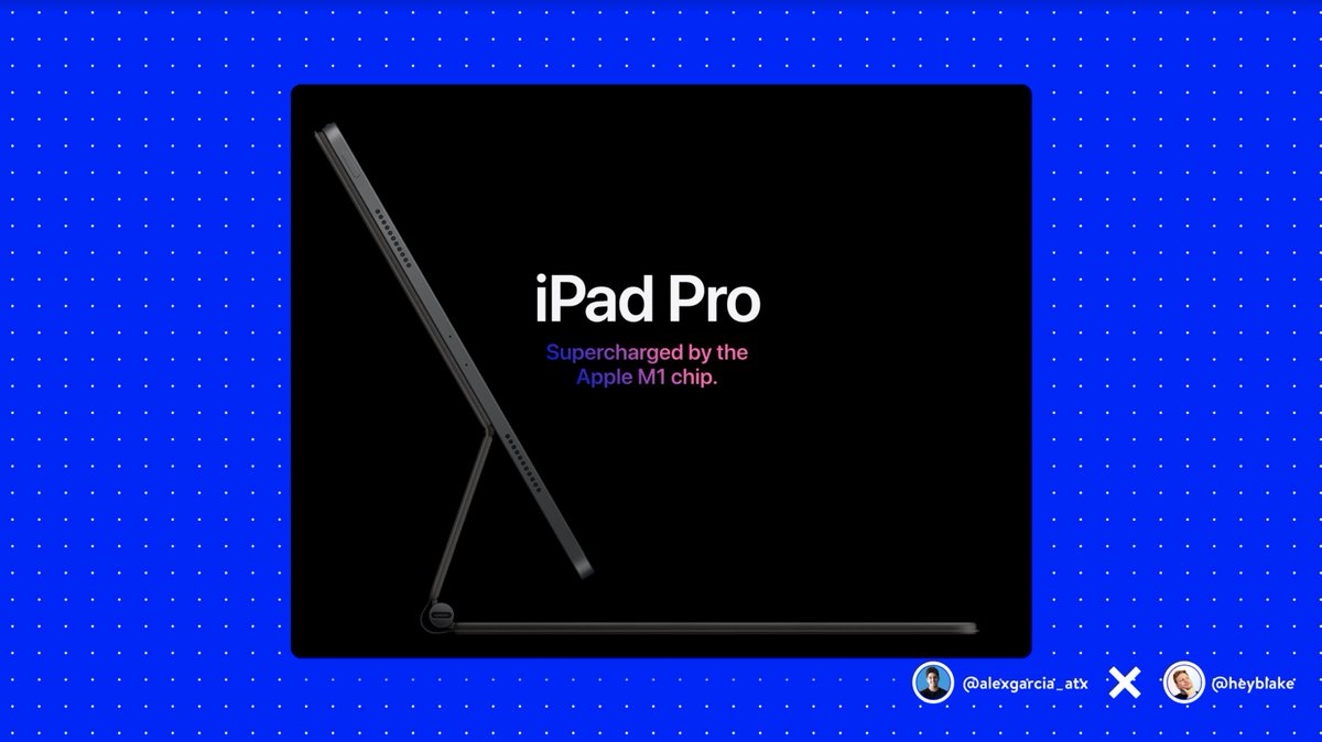
The iPhone vs. Blackberry is a modern example:

https://t.co/vN8KIJ5T6g
Hit the Headline

"On average, 5 times as many people read the headline vs. the body."

People are scared of writing clickbait titles.

But the truth is that clickbait exists only when you fail to keep your promise to the reader.

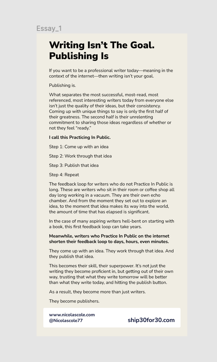
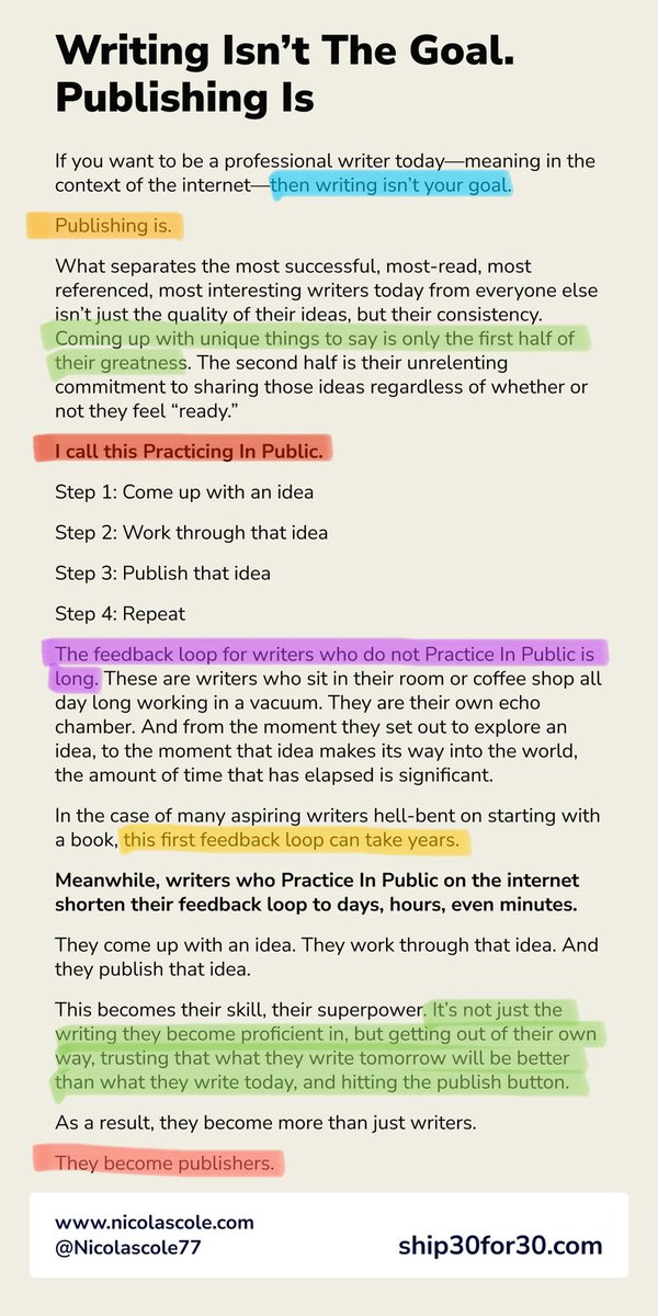
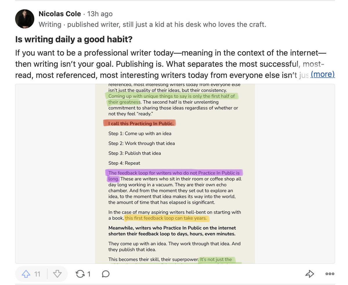
h/t @nicolascole77
Long Writing Works

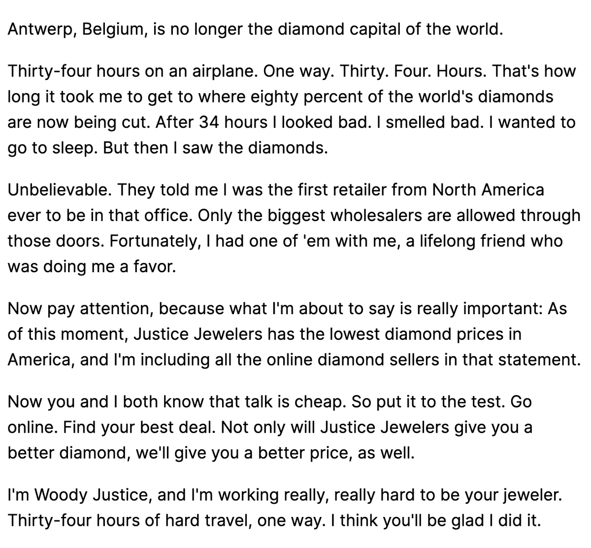
"The more you tell, the more you sell."

Readership falls off at 50 words.

But barely drops between 50 and 500 words.

Just like you will binge 20 hours of a great Netflix show, we read long writing as long as it delivers.
The Brand Image

95% of all advertising has no consistent theme year over year.

People are the same way.

We jump from thing to thing endlessly in search of our "passion".

What if you just focused 100% of your energy on ONE thing this year?
Double Down on Winners

"The best ads get discarded right when they start to pay off."

The best investments get sold too early.

If it works, make sure there is a clear reason to stop.

Don't let our never ending search for novelty win.
If you picked up a new insight, retweet the first tweet to teach a friend:
https://t.co/ObrTLOce1x
For more free frameworks, systems and business stories, join 6,288 others and sign up for my weekly newsletter here:

https://t.co/Zr6gAK3oP0
You can also check out all 38 lessons here!

More from Chris Hladczuk

More from Marketing

50 Marketing Threads That Will Teach You More Than Any Marketing Class 🧵

50. Fastest-growing companies use growth loops


49. 7 Proven growth hacking strategies (pt.1)


48. Steal These 7 growth hacks (pt.2)


47. 15 Lessons to write viral Twitter threads

You May Also Like

A brief analysis and comparison of the CSS for Twitter's PWA vs Twitter's legacy desktop website. The difference is dramatic and I'll touch on some reasons why.

Legacy site *downloads* ~630 KB CSS per theme and writing direction.

6,769 rules
9,252 selectors
16.7k declarations
3,370 unique declarations
44 media queries
36 unique colors
50 unique background colors
46 unique font sizes
39 unique z-indices

https://t.co/qyl4Bt1i5x


PWA *incrementally generates* ~30 KB CSS that handles all themes and writing directions.

735 rules
740 selectors
757 declarations
730 unique declarations
0 media queries
11 unique colors
32 unique background colors
15 unique font sizes
7 unique z-indices

https://t.co/w7oNG5KUkJ


The legacy site's CSS is what happens when hundreds of people directly write CSS over many years. Specificity wars, redundancy, a house of cards that can't be fixed. The result is extremely inefficient and error-prone styling that punishes users and developers.

The PWA's CSS is generated on-demand by a JS framework that manages styles and outputs "atomic CSS". The framework can enforce strict constraints and perform optimisations, which is why the CSS is so much smaller and safer. Style conflicts and unbounded CSS growth are avoided.