I’ve compiled 6 tips for the move online based on @AccessTCD & @SchoolofEdTCD research. During #schoolclosures last year we surveyed 1000+ students and 700+ teachers about their experience of #onlinelearning. Although it's difficult to be back here, we have learned so much. (1/N)
More from Education




Time for some thoughts on schools given the revised SickKids document and the fact that ON decided to leave most schools closed. ON is not the only jurisdiction to do so, but important to note that many jurisdictions would not have done so -even with higher incidence rates.
As outlined in the tweet by @NishaOttawa yesterday, the situation is complex, and not a simple right or wrong https://t.co/DO0v3j9wzr. And no one needs to list all the potential risks and downsides of prolonged school closures.
On the other hand: while school closures do not directly protect our most vulnerable in long-term care at all, one cannot deny that any factor potentially increasing community transmission may have an indirect effect on the risk to these institutions, and on healthcare.
The question is: to what extend do schools contribute to transmission, and how to balance this against the risk of prolonged school closures. The leaked data from yesterday shows a mixed picture -schools are neither unicorns (ie COVID free) nor infernos.
Assuming this data is largely correct -while waiting for an official publication of the data, it shows first and foremost the known high case numbers at Thorncliff, while other schools had been doing very well -are safe- reiterating the impact of socioeconomics on the COVID risk.
A group of Ontario experts led by SickKids has updated its guidance for school operation during the COVID-19 pandemic. The living document, COVID-19: Updated Guidance for School Operation During the Pandemic, can be read here: https://t.co/rotLqDqkQh pic.twitter.com/q7kVezAPoG
— SickKids_TheHospital (@SickKidsNews) January 21, 2021
As outlined in the tweet by @NishaOttawa yesterday, the situation is complex, and not a simple right or wrong https://t.co/DO0v3j9wzr. And no one needs to list all the potential risks and downsides of prolonged school closures.
1/It's the eve of provincial announcements on schools reopening for in-person instruction.
— Nisha Thampi (@NishaOttawa) January 20, 2021
Households are under stress and experts are divided on whether schools are unicorns or infernos.
Everyone wants to do right by kids, who have borne so much throughout this pandemic.
On the other hand: while school closures do not directly protect our most vulnerable in long-term care at all, one cannot deny that any factor potentially increasing community transmission may have an indirect effect on the risk to these institutions, and on healthcare.
The question is: to what extend do schools contribute to transmission, and how to balance this against the risk of prolonged school closures. The leaked data from yesterday shows a mixed picture -schools are neither unicorns (ie COVID free) nor infernos.
Assuming this data is largely correct -while waiting for an official publication of the data, it shows first and foremost the known high case numbers at Thorncliff, while other schools had been doing very well -are safe- reiterating the impact of socioeconomics on the COVID risk.




You May Also Like








1/OK, data mystery time.
This New York Times feature shows China with a Gini Index of less than 30, which would make it more equal than Canada, France, or the Netherlands. https://t.co/g3Sv6DZTDE
That's weird. Income inequality in China is legendary.
Let's check this number.
2/The New York Times cites the World Bank's recent report, "Fair Progress? Economic Mobility across Generations Around the World".
The report is available here:
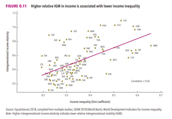
3/The World Bank report has a graph in which it appears to show the same value for China's Gini - under 0.3.
The graph cites the World Development Indicators as its source for the income inequality data.
4/The World Development Indicators are available at the World Bank's website.
Here's the Gini index: https://t.co/MvylQzpX6A
It looks as if the latest estimate for China's Gini is 42.2.
That estimate is from 2012.
5/A Gini of 42.2 would put China in the same neighborhood as the U.S., whose Gini was estimated at 41 in 2013.
I can't find the <30 number anywhere. The only other estimate in the tables for China is from 2008, when it was estimated at 42.8.
This New York Times feature shows China with a Gini Index of less than 30, which would make it more equal than Canada, France, or the Netherlands. https://t.co/g3Sv6DZTDE
That's weird. Income inequality in China is legendary.
Let's check this number.
2/The New York Times cites the World Bank's recent report, "Fair Progress? Economic Mobility across Generations Around the World".
The report is available here:
3/The World Bank report has a graph in which it appears to show the same value for China's Gini - under 0.3.
The graph cites the World Development Indicators as its source for the income inequality data.
4/The World Development Indicators are available at the World Bank's website.
Here's the Gini index: https://t.co/MvylQzpX6A
It looks as if the latest estimate for China's Gini is 42.2.
That estimate is from 2012.
5/A Gini of 42.2 would put China in the same neighborhood as the U.S., whose Gini was estimated at 41 in 2013.
I can't find the <30 number anywhere. The only other estimate in the tables for China is from 2008, when it was estimated at 42.8.