IMO we need Bitcoin to make a real run before it brings back the dumb money.
Thread:
"When is Alt Season?" is a question we all ask a lot so let's take a look at a possible scenario that could answer that question.
IMO we need Bitcoin to make a real run before it brings back the dumb money.
That FOMO didn't begin until roughly November of 2017, 11 months AFTER Bitcoin entered price discovery.
And the mania didn't begin until early December 2017 almost 1 year after Bitcoin entered price discovery.
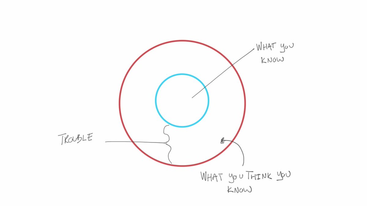
Google Confirmation Bias if you dont know it.
THAT is when we see an alt season. It will be once Bitcoin is far enough along into this new stage of price discovery
That is the point where you will see the mania begin again and that is when alts will move for real. I don't mean 2x or 5x. I mean 10x in one day, 100x in 1 month. Those are the moves that the mania produces.
More from Trading
I spent over 100 hours studying the best patterns in Technical Analysis taught to me by @niki_poojary.
Turns out, patterns trading is simple—if you follow these 8 Patterns:
Let's start: ↓
While studying her Twitter profile and with constant talks with her, I found these to be the most important patterns she focuses on always.
Then I wrote a small summary of what each pattern means.
Also attached are some examples from her tweets.
1/ Cup and handle Pattern
Happens during an uptrend.
The cup portion has a U-shaped appearance.
The bears are getting weaker as they are unable to drive the prices below the last low.
Subhasish Pani uses this a lot in stocks to spot bullish trades.
Eg
Eg
Turns out, patterns trading is simple—if you follow these 8 Patterns:
Let's start: ↓
While studying her Twitter profile and with constant talks with her, I found these to be the most important patterns she focuses on always.
Then I wrote a small summary of what each pattern means.
Also attached are some examples from her tweets.
1/ Cup and handle Pattern
Happens during an uptrend.
The cup portion has a U-shaped appearance.
The bears are getting weaker as they are unable to drive the prices below the last low.
Subhasish Pani uses this a lot in stocks to spot bullish trades.
Eg
5: When to play directional:
— Nikita Poojary (@niki_poojary) December 18, 2022
Whenever the index is moving in a single direction, its important to go with the trend.
A few weeks ago when BNF broke out of the cup and handle pattern, all we had to do was sell PEs.
Pls note: weekly TF chart is attached to just show the C&H BO pic.twitter.com/z0wgUzJW8t
Eg
#VOLTAS Another cup & handle pattern for cash positional pic.twitter.com/Jsc99xJfwY
— Nikita Poojary (@niki_poojary) October 23, 2019
You May Also Like
1/OK, data mystery time.
This New York Times feature shows China with a Gini Index of less than 30, which would make it more equal than Canada, France, or the Netherlands. https://t.co/g3Sv6DZTDE
That's weird. Income inequality in China is legendary.
Let's check this number.
2/The New York Times cites the World Bank's recent report, "Fair Progress? Economic Mobility across Generations Around the World".
The report is available here:
3/The World Bank report has a graph in which it appears to show the same value for China's Gini - under 0.3.
The graph cites the World Development Indicators as its source for the income inequality data.
4/The World Development Indicators are available at the World Bank's website.
Here's the Gini index: https://t.co/MvylQzpX6A
It looks as if the latest estimate for China's Gini is 42.2.
That estimate is from 2012.
5/A Gini of 42.2 would put China in the same neighborhood as the U.S., whose Gini was estimated at 41 in 2013.
I can't find the <30 number anywhere. The only other estimate in the tables for China is from 2008, when it was estimated at 42.8.
This New York Times feature shows China with a Gini Index of less than 30, which would make it more equal than Canada, France, or the Netherlands. https://t.co/g3Sv6DZTDE
That's weird. Income inequality in China is legendary.
Let's check this number.
2/The New York Times cites the World Bank's recent report, "Fair Progress? Economic Mobility across Generations Around the World".
The report is available here:
3/The World Bank report has a graph in which it appears to show the same value for China's Gini - under 0.3.
The graph cites the World Development Indicators as its source for the income inequality data.
4/The World Development Indicators are available at the World Bank's website.
Here's the Gini index: https://t.co/MvylQzpX6A
It looks as if the latest estimate for China's Gini is 42.2.
That estimate is from 2012.
5/A Gini of 42.2 would put China in the same neighborhood as the U.S., whose Gini was estimated at 41 in 2013.
I can't find the <30 number anywhere. The only other estimate in the tables for China is from 2008, when it was estimated at 42.8.