🚢 Atomic Essays Republishing Framework 🚢
1. Write Atomic Essay
2. Post image on Twitter
3. (Bonus) Copy/paste text as thread
4. Find relevant Question on Quora. Copy/paste Atomic Essay + image.
5. Copy/paste again on Medium.
6. Again on LinkedIn
7. Win
Guide below ✍️🚢👇
Step 1: Write Atomic Essay
I really enjoy writing right inside the Figma template. It helps give me a good sense of exactly how much "real estate" I have/have left before my time us up and I'm out of space.
Once finished, I export the image and send to my phone on Slack.
Step 2: Post image on Twitter
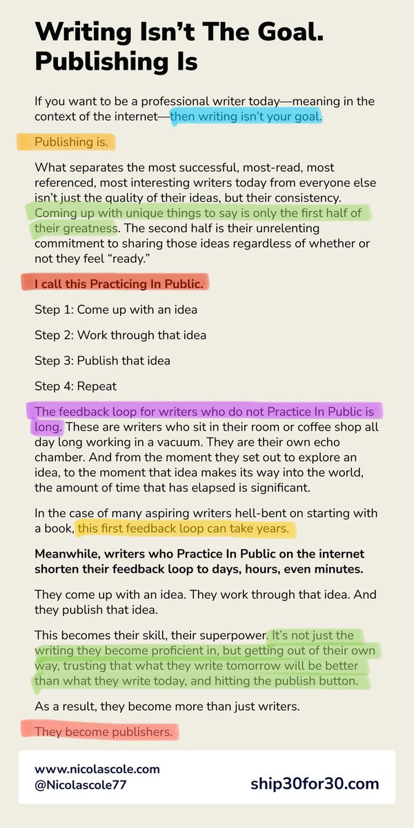
Before I publish my Atomic Essay on Twitter, I use the Edit/Photo Markup function on the iPhone to highlight standout sentences.
These are usually power-phrases: things the reader skims and thinks, "That's interesting," prompting them to read more.
Step 3: For the Ship 30 for 30 challenge, I only turn Atomic Essays into threads if...
1. The piece is SUPER actionable and lends itself well to the thread format (lots of bullets, quick points, lists, etc.)
or...
2. I'm referencing research and want to link to the pieces.
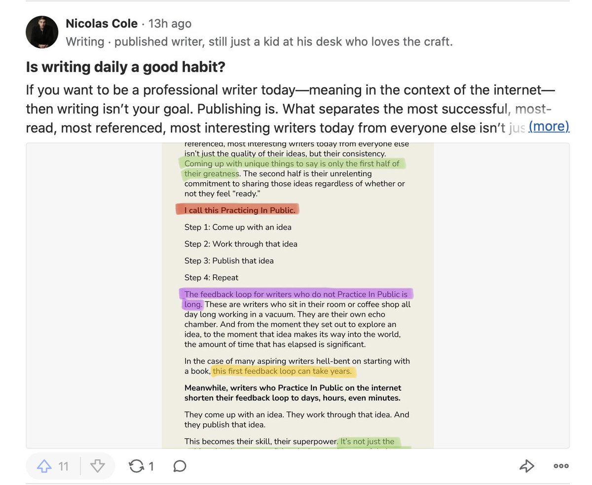
Step 4: Find relevant Question on Quora. Copy/paste Atomic Essay + image.
Search on Quora around the topic you wrote about. Find a related Question. Copy/paste the whole Atomic Essay as your "answer" (& fix formatting). Then include image so it appears in the thumbnail.