

More from Cleavon MD








🧵RACISM IN MEDICINE: This is disgusting! @KPMedSchool claims to be committed to diversity, equity & inclusion but SUSPENDS Dr. @ayshakhoury hours after being asked to teach med students about racial disparities in medicine wearing a "I can't breathe" t-shirt 1/10
@DrMarkSchuster
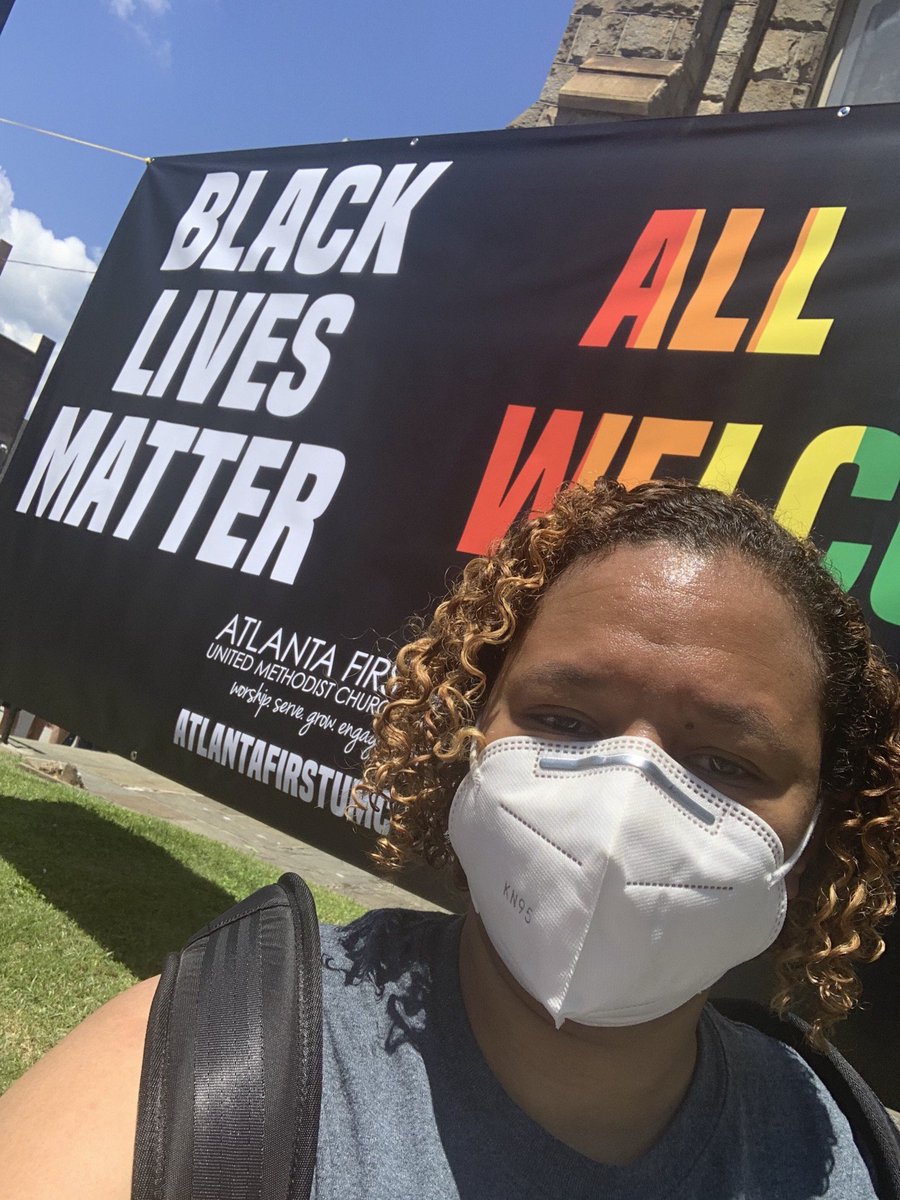
"When facilitators were asked to incorporate topics on bias & racial health disparities into the August 28, 2020 class, I decided to show up fully as a Black woman & physician. That morning, I paired a t-shirt with the words “I can’t breathe” with my usual African print attire"
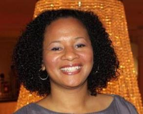
For six weeks, Dr. @ayshakhoury was removed from both the clinic and the classroom. She remains suspended from her teaching role at the medical school. 3/10
"How is it possible in the same summer that racism is repeatedly confirmed as a public health issue, I was placed on a now 18 week suspension after facilitating a medical school class incorporating topics of bias & racial health disparities?" @ayshakhoury
https://t.co/hO3RNmgH4v
Doctor at Kaiser Medical School Claims She Was Suspended for Talking Race
@DrMarkSchuster
"When facilitators were asked to incorporate topics on bias & racial health disparities into the August 28, 2020 class, I decided to show up fully as a Black woman & physician. That morning, I paired a t-shirt with the words “I can’t breathe” with my usual African print attire"
For six weeks, Dr. @ayshakhoury was removed from both the clinic and the classroom. She remains suspended from her teaching role at the medical school. 3/10
"How is it possible in the same summer that racism is repeatedly confirmed as a public health issue, I was placed on a now 18 week suspension after facilitating a medical school class incorporating topics of bias & racial health disparities?" @ayshakhoury
https://t.co/hO3RNmgH4v
Doctor at Kaiser Medical School Claims She Was Suspended for Talking Race



Today, @propublica published a searchable data set of videos from the Capitol hill attack that is organized by time and location. #SeditionHunters #SeditionVids https://t.co/yGO7iWLaC1
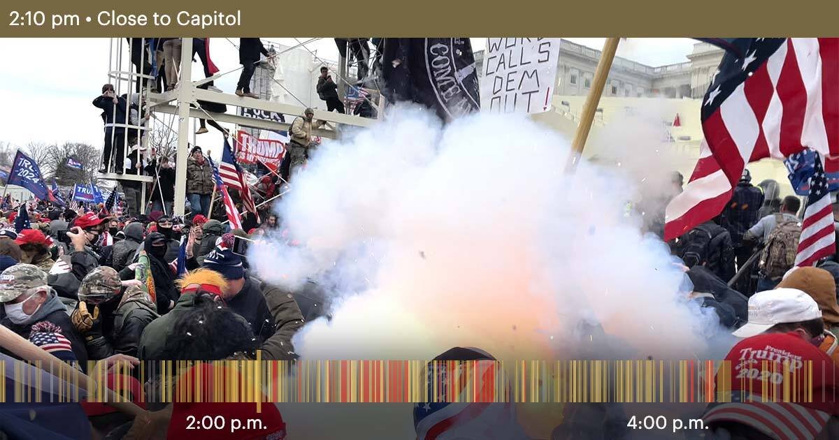
These are some of the hashtags being used to identify rioters. #SeditionHunters
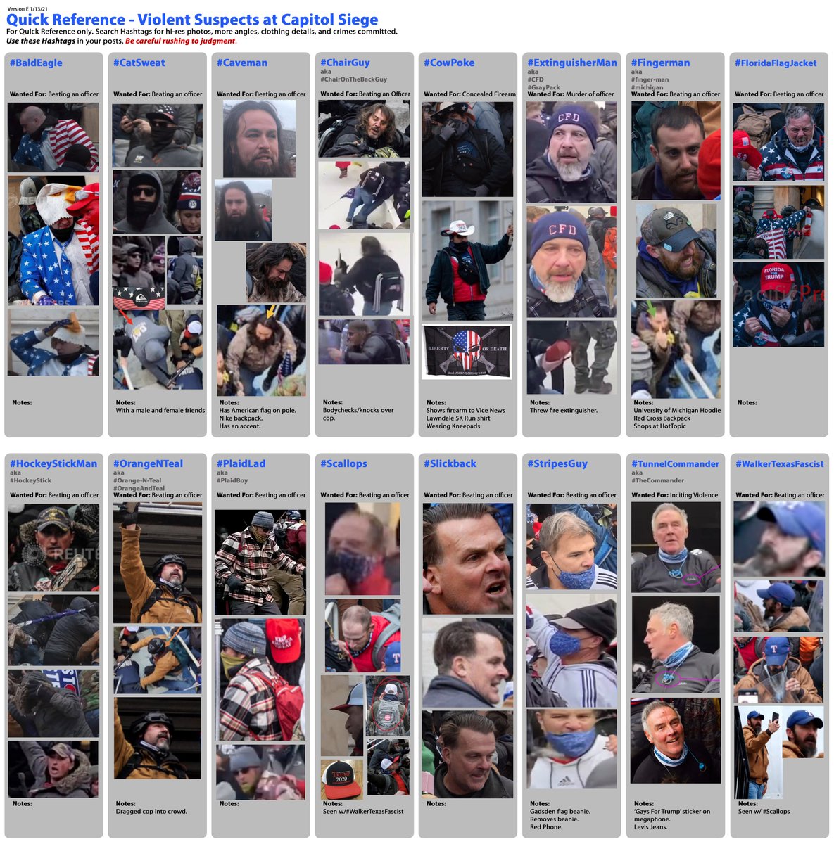
#StripesGuy
#ThePinMan
#EyeGouger
These are some of the hashtags being used to identify rioters. #SeditionHunters
#StripesGuy
#StripesGuy assaulted Officer Daniel Hodges. Hodges says, he was \u201cpractically foaming at the mouth.\u201d He ripped his mask off, took his baton, beat officer Hodges with it and bloodied his face. @DCPoliceDept @FBIWFO #SeditionVids https://t.co/fZMBpwlyzs pic.twitter.com/cCJbaJTvE9
— Cleavon MD (@Cleavon_MD) January 16, 2021
#ThePinMan
#ThePinMan assaulted and used a clear police shield to pin @DCPoliceDept Officer Daniel Hodges in a door jam. If you know this person call the FBI\u2019s Tipline at 1-800-CALL-FBI (1-800-225-5324) @FBIWFO #SeditionVids pic.twitter.com/1vOyG3LWWx
— Cleavon MD (@Cleavon_MD) January 16, 2021
#EyeGouger
#EyeGouger is wanted for assaulting a police officer and trying to gouge out his eye. If you know this person call the FBI\u2019s Tipline at 1-800-CALL-FBI (1-800-225-5324) @DCPoliceDept @FBIWFO #SeditionVids pic.twitter.com/cwnADdlaqn
— Cleavon MD (@Cleavon_MD) January 16, 2021
More from Government



2017 https://t.co/kiqQoWR57e

https://t.co/W18nqFlLru

The GOP got rid of the SCOTUS filibuster so they could jam through three fringy right-wing Alito clones, including one right before the election, but sure thing, bud.
“Uh, actually, they got rid of the SCOTUS filibuster because Harry Reid did it first for something totally different! I am very smart!”
No. Knock it off.
Here’s the thing about the “But Harry Reid...” excuse:
1. McConnell was holding up Obama nominees, some *for literal years* without a vote.
2. Had he *not* done that, Trump would have inherited *even more* vacant seats.
Sen. @JohnCornyn on budget reconciliation: "Chipping away at the rights of the minority may help you now. But you're sure to regret that someday." pic.twitter.com/12wwUkq43r
— The Hill (@thehill) February 1, 2021
https://t.co/W18nqFlLru
The GOP got rid of the SCOTUS filibuster so they could jam through three fringy right-wing Alito clones, including one right before the election, but sure thing, bud.
“Uh, actually, they got rid of the SCOTUS filibuster because Harry Reid did it first for something totally different! I am very smart!”
No. Knock it off.
Here’s the thing about the “But Harry Reid...” excuse:
1. McConnell was holding up Obama nominees, some *for literal years* without a vote.
2. Had he *not* done that, Trump would have inherited *even more* vacant seats.
You May Also Like

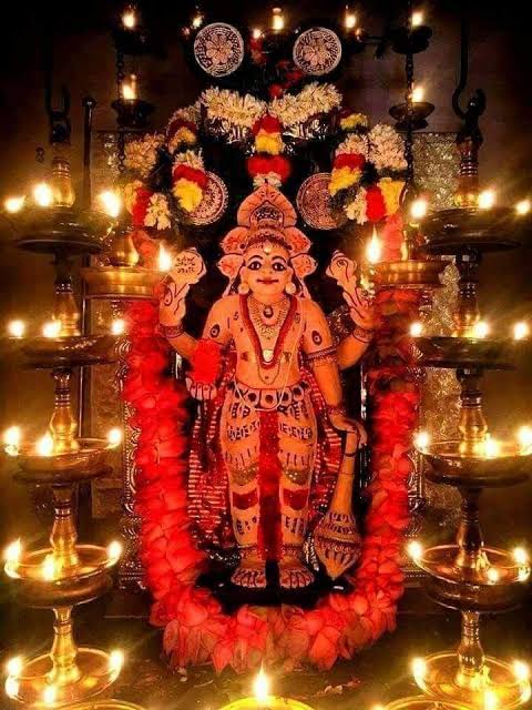

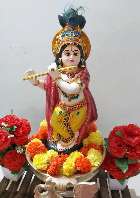
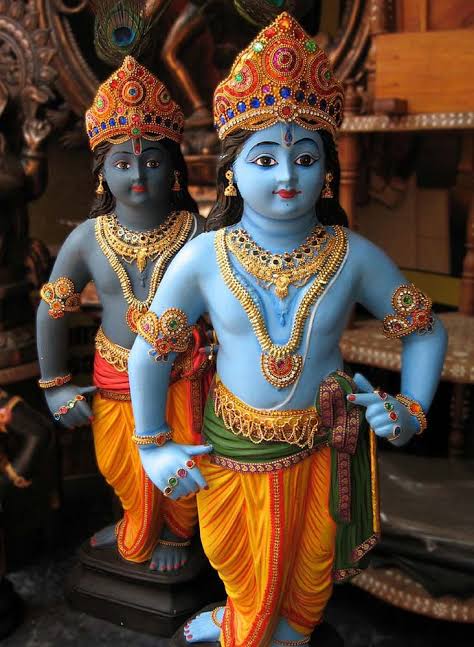

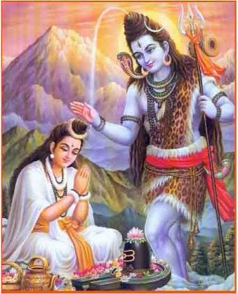


#sculpture #story -
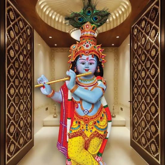
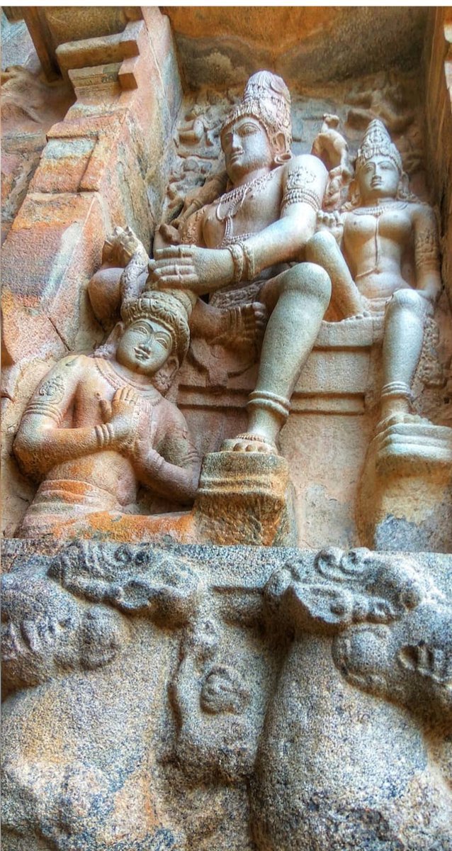
Chandesha-Anugraha Murti - One of the Sculpture in Brihadeshwara Temple at Gangaikonda Cholapuram - built by Raja Rajendra Chola I
This Sculpture depicts Bhagwan Shiva along with Devi Paravathi blessing Chandeshwara - one of the 63 Nayanmars.
#Thread
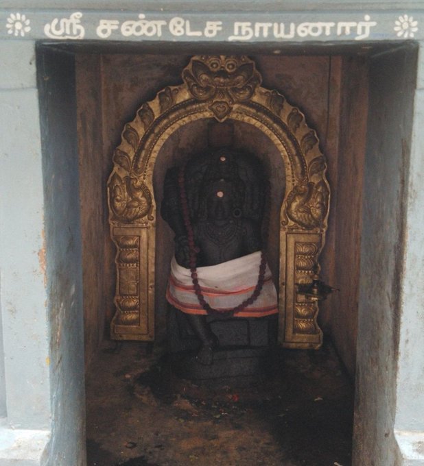
Chandeshwara/Chandikeshwara is regarded as custodian of Shiva Temple's wealth&most of Shiva temples in South India has separate sannathi for him.
His bhakti for Bhagwan Shiva elevated him as one of foremost among Nayanmars.
He gave importance to Shiva Pooja&protection of cows.
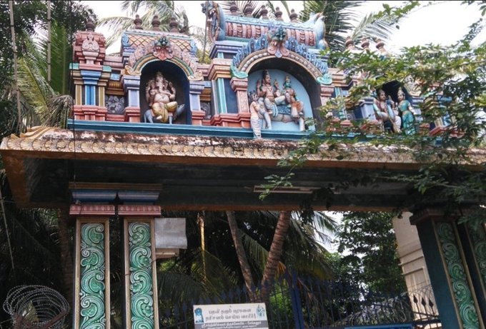
There are series of paintings, illustrating the #story of Chandikeshwar in the premises of
Sri Sathiyagireeswarar #Temple at Seinganur,near Kumbakonam,TN
Chandikeshwara's birth name
is Vichara sarman.He was born in the village of Senganur on the banks of River Manni.
His Parent names were Yajnathatan and Pavithrai.
Vichara Sarman was a gifted child and he learnt Vedas and Agamas at a very young age.
He was very devout and would always think about Bhagwan Shiva.
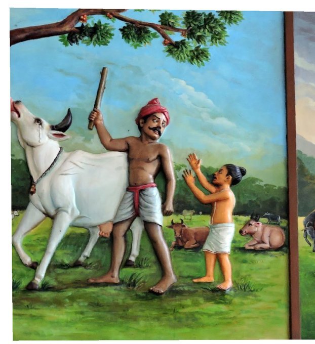
One day he saw a cowherd man brutally assaulting a cow,Vichara Sarman could not tolerate this. He spoke to cowherd: ‘Do you not know that the cow is worshipful & divine? All gods & Devas reside in https://t.co/ElLcI5ppsK it is our duty to protect cows &we should not to harm them.
Chandesha-Anugraha Murti - One of the Sculpture in Brihadeshwara Temple at Gangaikonda Cholapuram - built by Raja Rajendra Chola I
This Sculpture depicts Bhagwan Shiva along with Devi Paravathi blessing Chandeshwara - one of the 63 Nayanmars.
#Thread
Chandeshwara/Chandikeshwara is regarded as custodian of Shiva Temple's wealth&most of Shiva temples in South India has separate sannathi for him.
His bhakti for Bhagwan Shiva elevated him as one of foremost among Nayanmars.
He gave importance to Shiva Pooja&protection of cows.
There are series of paintings, illustrating the #story of Chandikeshwar in the premises of
Sri Sathiyagireeswarar #Temple at Seinganur,near Kumbakonam,TN
Chandikeshwara's birth name
is Vichara sarman.He was born in the village of Senganur on the banks of River Manni.
His Parent names were Yajnathatan and Pavithrai.
Vichara Sarman was a gifted child and he learnt Vedas and Agamas at a very young age.
He was very devout and would always think about Bhagwan Shiva.
One day he saw a cowherd man brutally assaulting a cow,Vichara Sarman could not tolerate this. He spoke to cowherd: ‘Do you not know that the cow is worshipful & divine? All gods & Devas reside in https://t.co/ElLcI5ppsK it is our duty to protect cows &we should not to harm them.