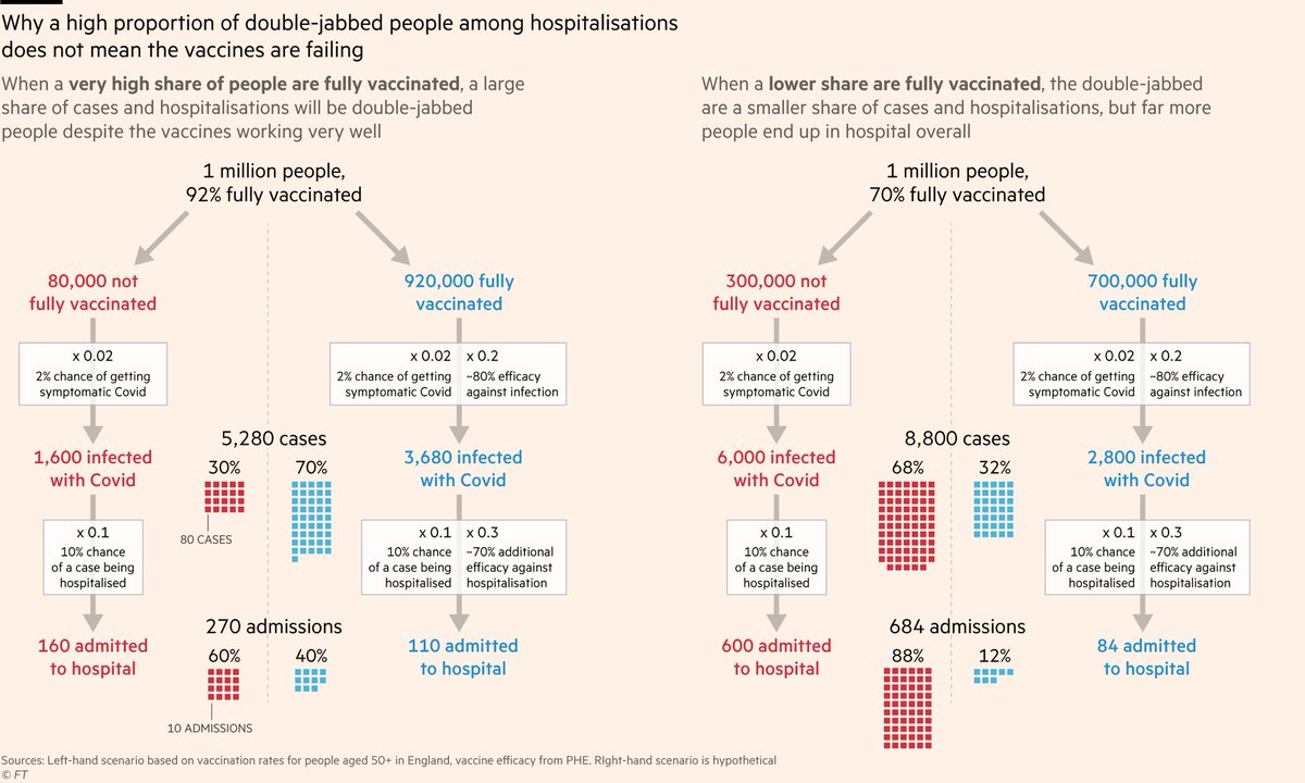
If fewer people are fully vaccinated, a smaller share of hospitalisations will be fully-vaxxed too, but this is not a good thing:
Overall there will be a lot more people in hospital because far more of the population is unprotected.
In other words: if you want to know whether the vaccination program is working, don't focus on whether the fully vaxxed make up 40% or 12% of hospitalisations.
Focus on whether the hospitalisation rate is 270 per million or 684 per million.
And since this is Twitter, I've prepared the same thing in meme form
But back to charts:
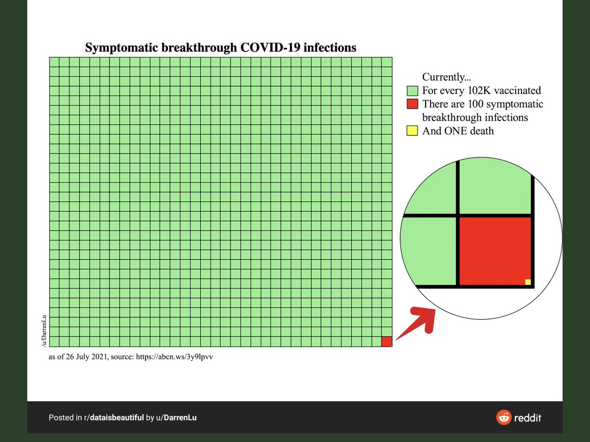
All the data we have suggests vaccines are working remarkably well. Far beyond what had been hoped for a year ago.
For example, a fully-vaxxed 80-year-old now has the same risk of dying from Covid as an unvaxxxed 50-year-old. That's an enormous drop in risk!
And we can see the game-changing impact of vaccinations clearly in the English hospitalisation data.
If it weren't for vaccines, more Covid patients would have been admitted to hospital yesterday than at the height of the winter peak. Instead we're 75% below it.
...which features other excellent lines like this from
@anthonybmasters, who has a brilliant seatbelt analogy for vaccines