Positioning in CSS allows you to display your element wherever you want on the screen
But when I was learning it, I found it little bit confusing😅
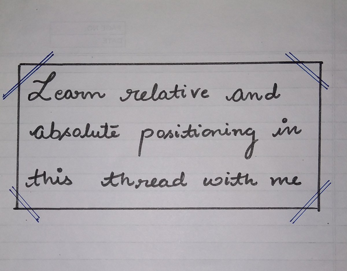
So in this thread I'll try to explain it in easiest manner with practical implementation. Let's start
THREAD🧵👇
There are 5 values that you can pass in position property
- static
- relative
- absolute
- fixed
- sticky
In this thread we will be focusing on relative and absolute positioning as both are widely used
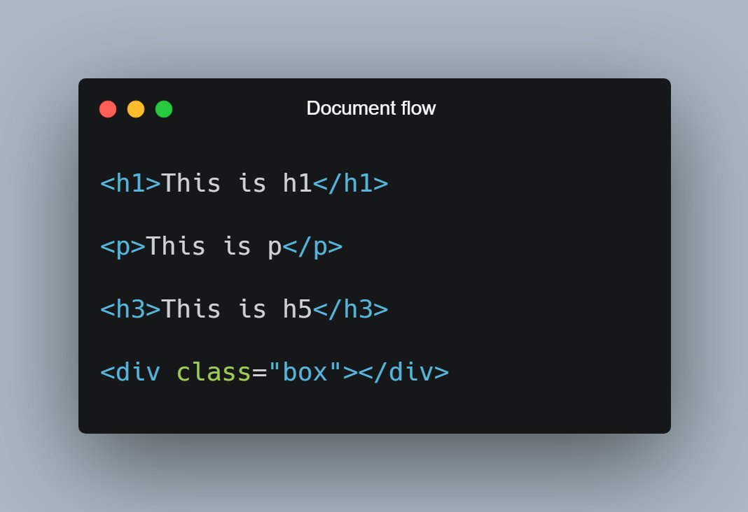
Let's start with understanding what document flow is?
📌 Elements are displayed on the screen as they written in the HTML document
Consider the following piece of code:
H1, P, H3 and div are displayed on the screen in exact order as they written in the HTML file.
As now you know about document flow, let's start with Relative positioning
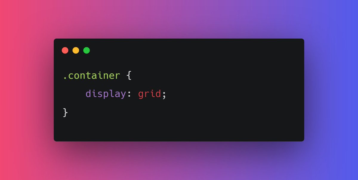
📌 Relative Position
- Relative positioning do not take an element out of document flow
- Relative positioning is relative to element's original position which can be changed using offset
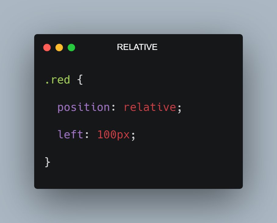
🔹 Relative position is relative to itself.
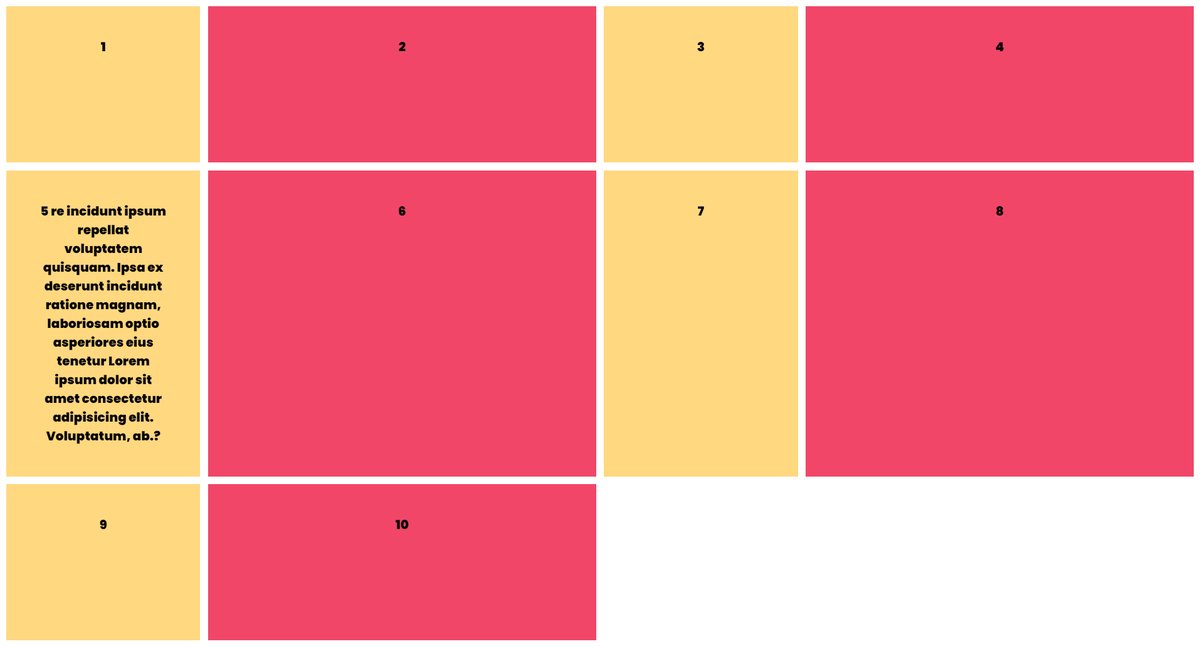
For example: Consider the code and output in the attached image below
As you can see red box is shifted 100px from left because I applied left offset after giving it relative positioning