I want to make clear that this thread *isn't* about returning to the past.
This is strictly about the future.
But we shouldn't simply accept things because "that's the way there are."
The past teaches us that we can do better.
Why does beauty matter?
That sounds like a superfluous question, but in the 21st century it has become a vital one.
Before I try & give you an explanation, however, I think we should define beauty.
Beauty isn't just ornamentation for the sake of it.
That is garishness. That is luxury. That is vanity.
This is *not* beauty:
But compare these two train station bridges.
Both ordinary, everyday things.
One is beautiful, & the other is not.
Beauty is that aesthetic quality which elevates ordinary things into something more meaningful.
It is what gives us - humans - something more than just a material, automated, machine-like existence.
A great example is the bathroom.
Ostensibly a place of supreme utility and nothing else. A personal waste management facility, basically...
Really?
Another good example is something as simple as door-handles.
They don't need to be dripping with gold. But even the slightest detail or character can work wonders.
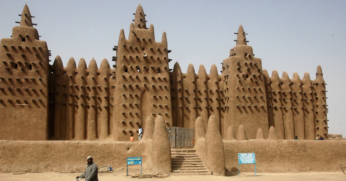
There is no single aesthetic standard.
That's why there are beautiful things in every country around the world, and why they all look different.
And that's how it ought to be. Why would we want everything to look the same?
And when beauty dies, everything *does* start to look the same. Usability has no identity.
Cities around the world once looked totally different. Now they are becoming identical.
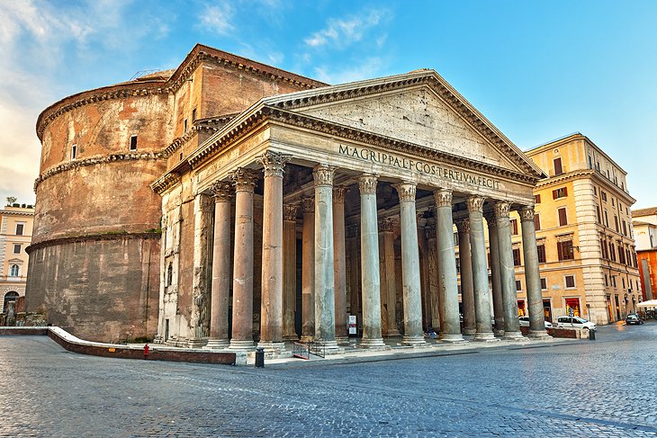
But don't just take my word for the importance of beauty. Where do tourists go?
Rome, Paris, Venice, Kyoto, Istanbul...
What do those cities all have in common?
Why do people get married in *nice* buildings rather than, say, warehouses?
That's a serious question.
Whether churches, country houses, hotels, or town halls, people seem to prefer a - dare I say it - beautiful location.
And when people actually do get married in warehouses....
They choose beautiful warehouses with aesthetic character!
Why do people decorate their homes? Another genuine question.
The human yearning for beauty - not luxury, but aesthetic character - is undeniable.
So why have things become so ugly? Usability has become the priority.
A vitally important point is that beauty and utility are NOT mutually exclusive.
The Roman architect Vitruvius believed that every building should have three qualities:
-strength
-usefulness
-beauty
If that was possible 2000 years ago, why not now?
Things *should* be useful, no less than they should be beautiful.
But neither should be allowed to take precedence at the cost of the other.
The elevator on the left is both, but the one on the right isn't...
What's the danger of a world without beauty?
If everything is simply functional, simply useful, then life becomes a mere conveyor belt.
It turns humans into machines of consumption, labour, & reproduction.
Aren't we more than that?
It's also a conversation with future generations.
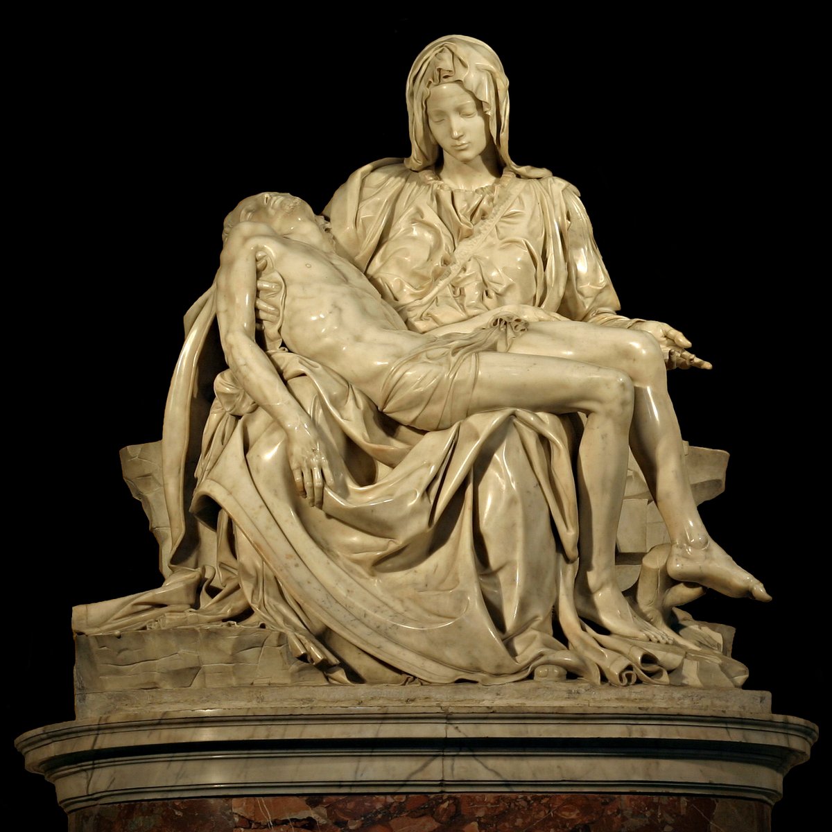
All over the world, our ancestors have left behind works of art & architecture for us to enjoy, admire, and use.
What do we want to leave for future generations? Buildings that need knocking down in 50 years, or something more?
As for the causes - that's another thread.
In previous threads people have mentioned capitalism, economics, the loss of religious faith etc.
No doubt the causes are multiple & compound
But the first step is recognising the problem.
Some will raise the objection that beauty costs money...
It's a question of priority, not cost. And, therefore, it is a choice - conscious or unconscious - every time.
This boiler-plate new building at Durham University, England, cost £40 million.
Did it *have* to look this way?
Or could the view that a beautiful building can inspire students have been factored in?
The trade-off might have been to make it a little smaller. But that might just be a worthy trade-off.
Second - even when beauty *does* cost more... what price is too high for a society whose architecture and design doesn't treat people like machines?
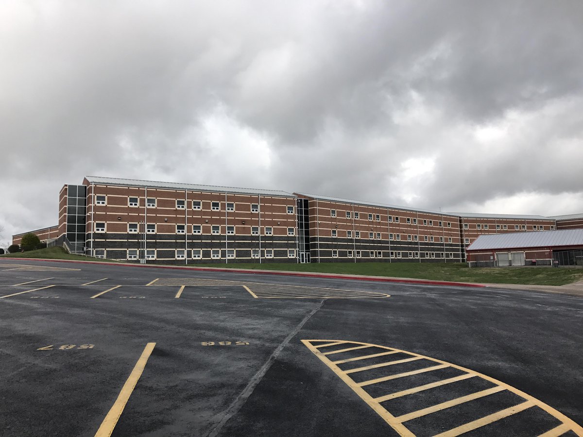
Or one in which most new schools look like prisons?! Is cutting costs really *that* important?
I think that's enough for now.
How can beauty come back to life?
Meanwhile I'm going to take a walk and listen to Dvořák's 6th symphony...
I went for a lovely long walk.
Glad to see that this thread has got people talking!
And if you liked it, then my newsletter Areopagus may also be of interest to you.
I share seven short lessons every Friday. They include art, architecture, and history.
https://t.co/44CfKFcWJ8