Some simulation platforms that caught my eye this year 🧵

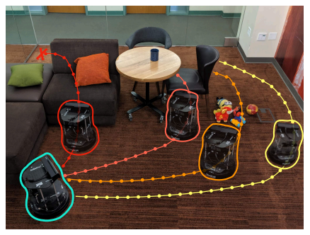
RoboThor from @allen_ai

https://t.co/Ch6GvWHHgP
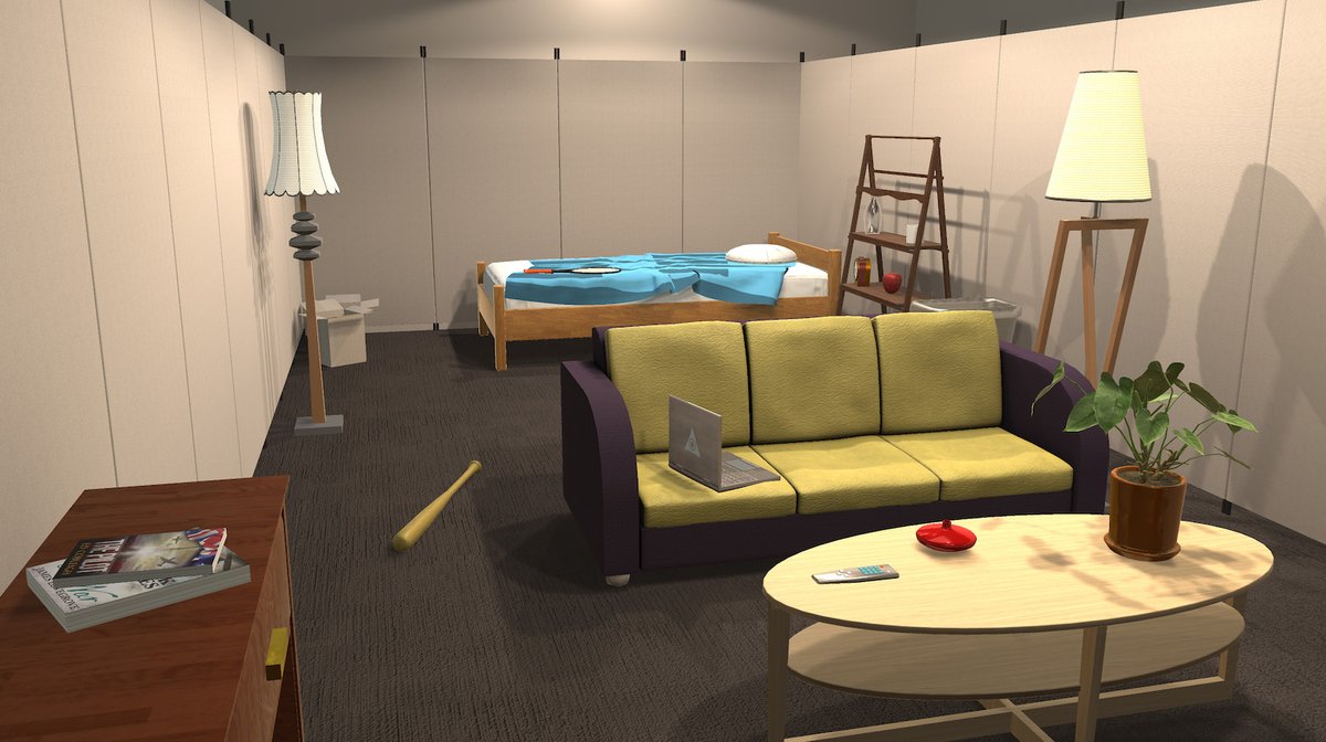
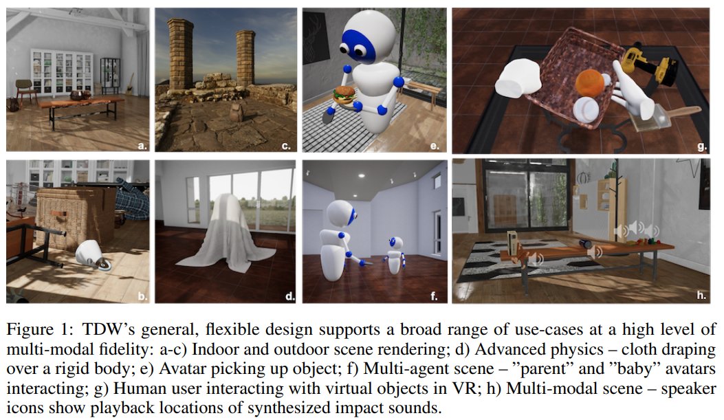
ThreeDWorld: A Platform for Interactive Multi-Modal Physical Simulation

https://t.co/vEXqGx1ddA

https://t.co/I6UQKTDf41
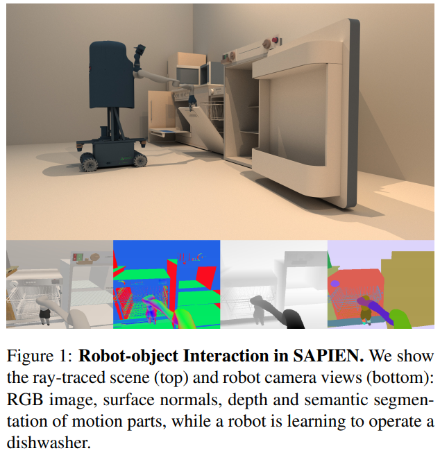
SAPIEN: A SimulAted Part-based Interactive ENvironment

https://t.co/khJN7xZifp

https://t.co/pc7BeELFsF
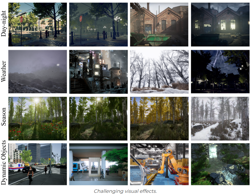
TartanAir: A Dataset to Push the Limits of Visual SLAM

https://t.co/18kPS3xSeX

https://t.co/o6YQVWlTji
Interactive Gibson: A Benchmark for Interactive Navigation in Cluttered Environments

https://t.co/iUMCZK1o8c
virtual home (v2)

https://t.co/cvv4G2MN04
AllenAct: A Framework for Embodied AI Research

https://t.co/7d2C2pJR0W

https://t.co/Ch2blo8VC1
robosuite: A Modular Simulation Framework and Benchmark for Robot Learning

https://t.co/pmp5Au2s5A
NeuralSim: Augmenting Differentiable Simulators with Neural Networks

https://t.co/dQhkE9Kx59
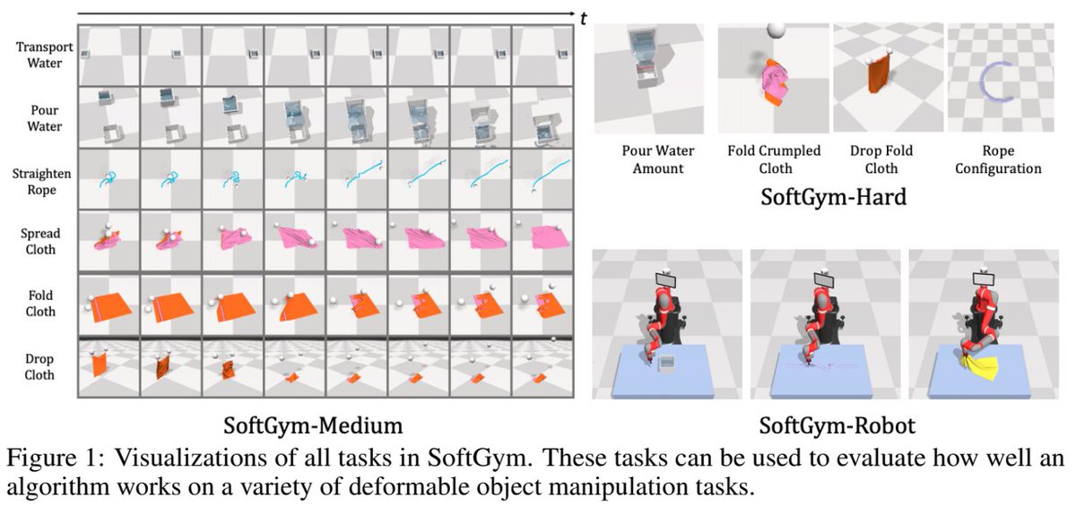
SoftGym: Benchmarking Deep Reinforcement Learning for Deformable Object Manipulation

https://t.co/Y0fsAOVUzr
Flightmare: A Flexible Quadrotor Simulator

https://t.co/p1NfyJrPHm
TriFinger: An Open-Source Robot for Learning Dexterity

https://t.co/yw4wmY5zII
Eldersim: A Synthetic Data Generation Platform For Human Action Recognition In Eldercare Applications

https://t.co/TD43xqMZZu

More from Tech

One of the best decisions I made during a very turbulent 2020 was to leave conventional coding behind and embrace the #nocode movement. @bubble made this a reality. Although my own journey thus far is premature, I’ve learned a lot so here’s a power thread on....


‘How I created @buildcamp sales funnel landing page in under 2hours’.

Preview here 👇

https://t.co/s9P5JodSHe

Power thread here 👇

1. Started with a vanilla bubble app ensuring that all styles and UI elements were removed. Created a new page called funnel and set the page size to 960px as this allows the page to render proportionately on both web and mobile when hitting responsive breakpoints.


2. Began dropping elements onto the page to ‘find the style’. These had to be closely aligned to our @buildcamp branding so included text, buttons and groups - nothing too heavy. Played around with a few fonts, colors and gradients and thus pinned down the following style guide.


3. Started to map out sections using groups as my ‘containers’ to hold the relevant information and imagery needed to pad out the sales pitch. At this point, they were merely blocks of color #ff6600 with reduced opacity set to 5% to ease page flair.

You May Also Like