https://t.co/o4NuuokBvw
I used to wear Wonder Woman Underoos as a kid. My mother would make me behave by telling me I wouldn't be able to watch the original Lynda Carter show. I was OBSESSED.
Which makes the current DCEU version of WW downright depressing for me.
/THREAD
https://t.co/o4NuuokBvw
Zero social commentary. Zero layers. Boring and dumb.
Imagine the wow-factor of seeing classic DCEU shots, but this time we see that Diana was there the entire time, fighting alongside Batman and Superman.
We just didn't see her. We didn't give her any credit. But she was there all along.
Then how?
"You tell me," she says.
I was raised by a single mom who worked three jobs to keep the lights on. She had no time for taking credit. #badass
More from Society

The UN just voted to condemn Israel 9 times, and the rest of the world 0.
View the resolutions and voting results here:
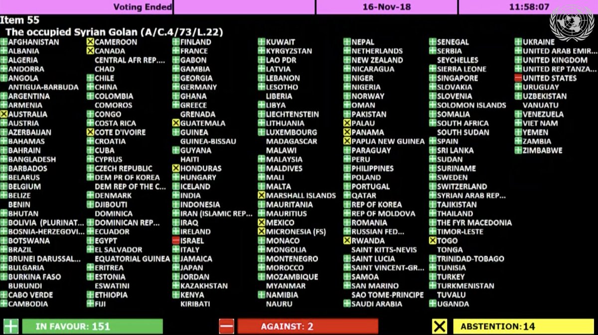
The resolution titled "The occupied Syrian Golan," which condemns Israel for "repressive measures" against Syrian citizens in the Golan Heights, was adopted by a vote of 151 - 2 - 14.
Israel and the U.S. voted 'No' https://t.co/HoO7oz0dwr
The resolution titled "Israeli practices affecting the human rights of the Palestinian people..." was adopted by a vote of 153 - 6 - 9.
Australia, Canada, Israel, Marshall Islands, Micronesia, and the U.S. voted 'No' https://t.co/1Ntpi7Vqab

The resolution titled "Israeli settlements in the Occupied Palestinian Territory, including East Jerusalem, and the occupied Syrian Golan" was adopted by a vote of 153 – 5 – 10.
Canada, Israel, Marshall Islands, Micronesia, and the U.S. voted 'No'
https://t.co/REumYgyRuF

The resolution titled "Applicability of the Geneva Convention... to the
Occupied Palestinian Territory..." was adopted by a vote of 154 - 5 - 8.
Canada, Israel, Marshall Islands, Micronesia, and the U.S. voted 'No'
https://t.co/xDAeS9K1kW

View the resolutions and voting results here:
The resolution titled "The occupied Syrian Golan," which condemns Israel for "repressive measures" against Syrian citizens in the Golan Heights, was adopted by a vote of 151 - 2 - 14.
Israel and the U.S. voted 'No' https://t.co/HoO7oz0dwr
The resolution titled "Israeli practices affecting the human rights of the Palestinian people..." was adopted by a vote of 153 - 6 - 9.
Australia, Canada, Israel, Marshall Islands, Micronesia, and the U.S. voted 'No' https://t.co/1Ntpi7Vqab
The resolution titled "Israeli settlements in the Occupied Palestinian Territory, including East Jerusalem, and the occupied Syrian Golan" was adopted by a vote of 153 – 5 – 10.
Canada, Israel, Marshall Islands, Micronesia, and the U.S. voted 'No'
https://t.co/REumYgyRuF
The resolution titled "Applicability of the Geneva Convention... to the
Occupied Palestinian Territory..." was adopted by a vote of 154 - 5 - 8.
Canada, Israel, Marshall Islands, Micronesia, and the U.S. voted 'No'
https://t.co/xDAeS9K1kW


Patriotism is an interesting concept in that it’s excepted to mean something positive to all of us and certainly seen as a morally marketable trait that can fit into any definition you want for it.+
Tolstoy, found it both stupid and immoral. It is stupid because every patriot holds his own country to be the best, which obviously negates all other countries.+
It is immoral because it enjoins us to promote our country’s interests at the expense of all other countries, employing any means, including war. It is thus at odds with the most basic rule of morality, which tells us not to do to others what we would not want them to do to us+
My sincere belief is that patriotism of a personal nature, which does not impede on personal and physical liberties of any other, is not only welcome but perhaps somewhat needed.
But isn’t adherence to a more humane code of life much better than nationalistic patriotism?+
Göring said, “people can always be brought to the bidding of the leaders. That is easy. All you have to do is tell them they are being attacked, and denounce the peacemakers for lack of patriotism and exposing the country to danger. It works the same in any country.”+
\u0926\u0947\u0936 \u092e\u0947\u0902 \u092a\u0939\u0932\u0940 \u092c\u093e\u0930 \U0001f1ee\U0001f1f3
— AAP (@AamAadmiParty) March 12, 2021
\u0926\u0947\u0936\u092d\u0915\u094d\u0924\u093f \u0915\u0940 \u0938\u094d\u092a\u0947\u0936\u0932 \u0915\u094d\u0932\u093e\u0938 \u0932\u0917\u093e\u090f\u0917\u0940 @ArvindKejriwal \u0938\u0930\u0915\u093e\u0930\u0964
\u090f\u0915 \u092a\u093e\u0920\u094d\u092f\u0915\u094d\u0930\u092e \u092c\u0928\u093e\u092f\u093e \u091c\u093e\u090f\u0917\u093e, \u091c\u093f\u0938\u0938\u0947 \u092c\u091a\u094d\u091a\u094b\u0902 \u092e\u0947\u0902 \u0915\u0942\u091f \u0915\u0942\u091f \u0915\u0930 \u0926\u0947\u0936\u092d\u0915\u094d\u0924\u093f \u092d\u0930\u0940 \u091c\u093e\u090f\u0917\u0940\u0964 pic.twitter.com/iO6WMBh4YG
Tolstoy, found it both stupid and immoral. It is stupid because every patriot holds his own country to be the best, which obviously negates all other countries.+
It is immoral because it enjoins us to promote our country’s interests at the expense of all other countries, employing any means, including war. It is thus at odds with the most basic rule of morality, which tells us not to do to others what we would not want them to do to us+
My sincere belief is that patriotism of a personal nature, which does not impede on personal and physical liberties of any other, is not only welcome but perhaps somewhat needed.
But isn’t adherence to a more humane code of life much better than nationalistic patriotism?+
Göring said, “people can always be brought to the bidding of the leaders. That is easy. All you have to do is tell them they are being attacked, and denounce the peacemakers for lack of patriotism and exposing the country to danger. It works the same in any country.”+
You May Also Like


1/“What would need to be true for you to….X”
Why is this the most powerful question you can ask when attempting to reach an agreement with another human being or organization?
A thread, co-written by @deanmbrody:
2/ First, “X” could be lots of things. Examples: What would need to be true for you to
- “Feel it's in our best interest for me to be CMO"
- “Feel that we’re in a good place as a company”
- “Feel that we’re on the same page”
- “Feel that we both got what we wanted from this deal
3/ Normally, we aren’t that direct. Example from startup/VC land:
Founders leave VC meetings thinking that every VC will invest, but they rarely do.
Worse over, the founders don’t know what they need to do in order to be fundable.
4/ So why should you ask the magic Q?
To get clarity.
You want to know where you stand, and what it takes to get what you want in a way that also gets them what they want.
It also holds them (mentally) accountable once the thing they need becomes true.
5/ Staying in the context of soliciting investors, the question is “what would need to be true for you to want to invest (or partner with us on this journey, etc)?”
Multiple responses to this question are likely to deliver a positive result.
Why is this the most powerful question you can ask when attempting to reach an agreement with another human being or organization?
A thread, co-written by @deanmbrody:
Next level tactic when closing a sale, candidate, or investment:
— Erik Torenberg (@eriktorenberg) February 27, 2018
Ask: \u201cWhat needs to be true for you to be all in?\u201d
You'll usually get an explicit answer that you might not get otherwise. It also holds them accountable once the thing they need becomes true.
2/ First, “X” could be lots of things. Examples: What would need to be true for you to
- “Feel it's in our best interest for me to be CMO"
- “Feel that we’re in a good place as a company”
- “Feel that we’re on the same page”
- “Feel that we both got what we wanted from this deal
3/ Normally, we aren’t that direct. Example from startup/VC land:
Founders leave VC meetings thinking that every VC will invest, but they rarely do.
Worse over, the founders don’t know what they need to do in order to be fundable.
4/ So why should you ask the magic Q?
To get clarity.
You want to know where you stand, and what it takes to get what you want in a way that also gets them what they want.
It also holds them (mentally) accountable once the thing they need becomes true.
5/ Staying in the context of soliciting investors, the question is “what would need to be true for you to want to invest (or partner with us on this journey, etc)?”
Multiple responses to this question are likely to deliver a positive result.